Series: Artful Academy 2020 journal #1
I keep looking at online courses and being really tempted by them, but then I remember that I still have half of the Wanderlust 2019 projects left to do, not to mention all the other card-making, Copic colouring, and mixed media classes I’ve signed up for over the years. So I ignore them, telling myself that they’ll still be there if ever I’m really stuck for something to do.
Having said that, I did sign up to one class back at the start of the year. Artful Academy are running a free, year-long art journalling challenge with one prompt and example page every month. I figured that there was a chance that I might be able to keep up with that. Of course that was before coronavirus and lockdown came along and did for my motivation, though I have managed to get caught up now.
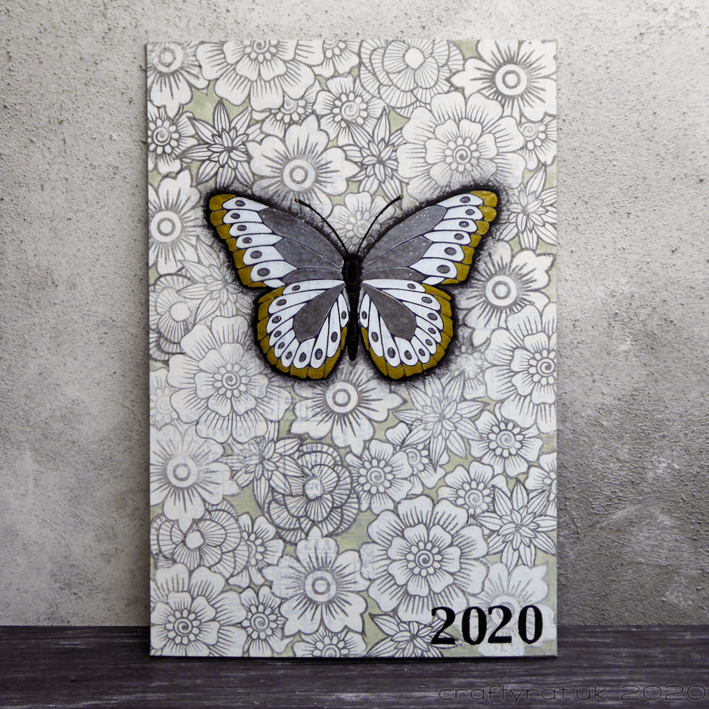
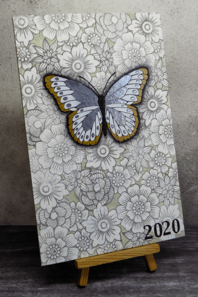
But journals need covers, so before the January class, there was a bonus lesson to create this cover.
The class is still open, so if you want to see the video of Katy Leitch making her version, you can. The process was simple, if a little time-consuming.
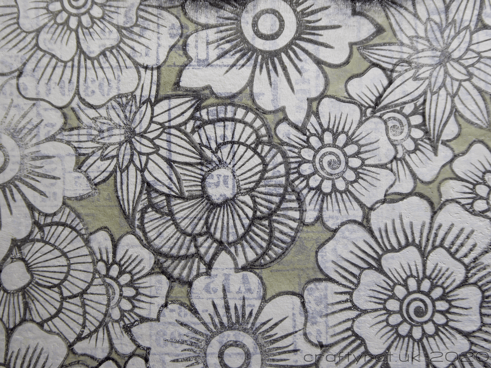
First, stamp over the whole of the background to provide a bit of texture. It will look far too busy, but that’s okay because the next thing is to cover it with gesso, leaving just a faint image showing through.

Now stamp a large focal image and create a mask for it. Collect some smaller stamps (I used flowers) and make a couple of masks for each of them. And this next bit is the time-consuming part: stamping and masking as you go, cover the whole of the rest of the journal cover with your smaller images.
Take a break, have a cup of tea, and then add shading around your focal image to set it off from the rest of the stamping and add some colour to it. I kept mine nice and neutral by using gold and my favourite Molotow liquid chrome pen. I also picked a soft colour — Zig Clean Color Real Brush pale dawn grey — to fill in the gaps between my background stamping.
If I had been following the lesson closely, I would have added some inspirational words around my butterfly now, but I much prefer it as it is. I just added the year in the bottom corner to finish it off.
Discover more from Crafty Rat
Subscribe to get the latest posts sent to your email.

I love this! That butterfly is gorgeous! It makes a perfect focal point! Thanks for sharing!
LikeLiked by 1 person
Thank you! I nearly went with bright colours for the butterfly, but I’m so glad I stuck with the chrome and gold, it turned out better than I expected.
LikeLiked by 1 person