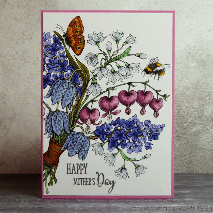
Yes, I know, another Power Poppy image, but they are so good for Mother’s Day cards; I used this one for my other half’s mum this year, though I actually coloured the image a couple of years ago during a Daily Marker 30 Day Coloring Challenge — it’s good to use the occasional coloured image from my stash for a change, rather than feel that I have to start from scratch each time.
The colouring was all pretty straightforward. The only thing I had to tweak was the ribbon. I originally laid down a base layer of Y06, added R85 to the shadow areas, and then blended that out with Y38; unfortunately, the result was too bright compared to the rest of the palette, so I toned it down with a light coat of W3.
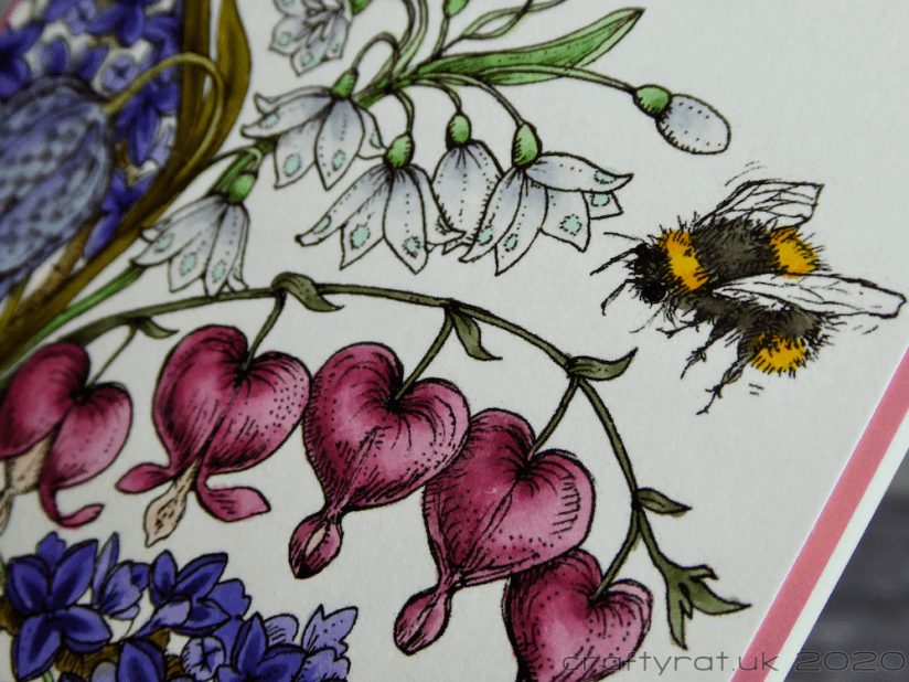
Glazing colours this way can be really useful and not just for changing the tone of an area — I often use it for colouring clothing, especially if I want to make something striped. If you create your shading on the base layer with grey markers, you can get away with laying flat colour over the top for the pattern. You need to practise a bit to get the strength of the colours and greys balanced, but it’s much easier than trying to do the shading on each individual stripe on a small image.
Copic markers:
pink hearts – R81, R83, R85, R56, R00, R0000
large lilac – BV0000, BV00, BV11, BV02, BG11 (glazing layer over top)
small purple – BV02, BV13, BV17
small grey – C0, C1, C3, BG11
leaves/stalks – random selection of greens and browns
bee – Y19, Y38, W5, W7
butterfly – W5, W7, Y06, Y38, R85
ribbon – Y06, R85, Y38, W3
Supplies:
- stamps:
Clearly Besotted – fresh flowers - digital stamps:
Power Poppy – spring meadow bouquet - inks:
Versafine – smokey gray - pens:
Gelly Roll – glaze – black - paper and card:
Neenah Solar White 216gsm
Hunkydory Adorable Scorable

Discover more from Crafty Rat
Subscribe to get the latest posts sent to your email.

Oh this is gorgeous! I love the colors! Thanks for sharing!
LikeLiked by 1 person
Thank you! I think I’m slowly getting better at choosing colour palettes…
LikeLiked by 1 person