Series: Artful Academy 2020 journal #2
After creating the cover for my Artful Academy class journal, I was determined to do my best to keep up with the monthly challenge. Each month has a prompt word — January’s was “list” — and a video of one of the tutors making their journal page as inspiration.
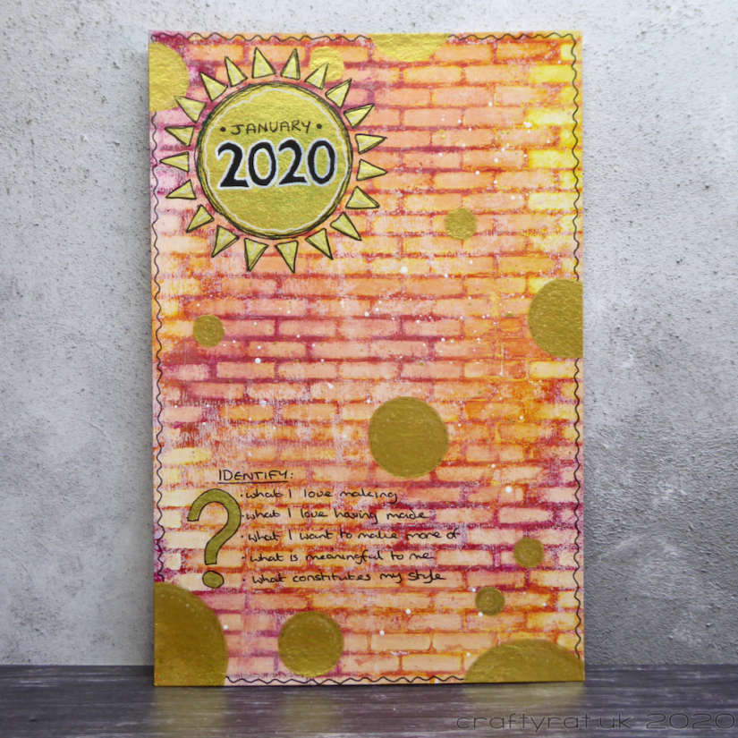
The highlighted technique for this page was lifting acrylic paint from the background through a stencil; I chose a simple brick stencil for mine as it’s really easy to line up to cover the whole page 🙂 You have to work quite quickly, especially if you’re using fluid acrylics, which don’t take long to dry. Also, it’s best to put down a layer of gesso first otherwise the paint soaks into the paper and you don’t get such a clean effect. Apparently some baby wipes have alcohol in them which gets an even cleaner result… mine don’t.
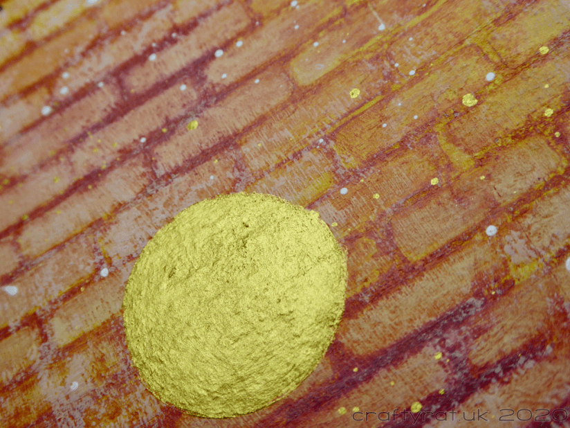
Rather than make my date circle in a complementary colour (as suggested in the tutorial), I went with gold — I still hate gold for jewellery and bathroom fittings and the like, but I have rather changed my mind about it for accents in my art. I also added a few extra circles dotted around.
My list is an attempt to figure out what sort of art I want to make. I have the beginnings of a style in my Copic colouring; probably because that’s what I’ve done most of. With every other medium or craft, I just love playing with pretty much any technique that I come across. I think I need to go back through all the “not cards” I’ve made and — with the benefit of a bit of distance — see which ones I still love.

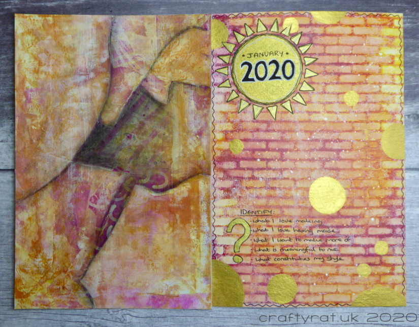
Because I’m doing these on separate pages rather than in a pre-made journal, I would be left with the left half of the spread being the, probably messy, back of the previous month’s page. I could just have covered it with gesso to have a clean page, but I had the idea to make a collage in matching colours instead.
I’m very happy with how this collage turned out: matching papers with paint and gesso brayered over the top and charcoal shading. I got the balance of “matching but not the same” right in this one, which cannot be said for a couple of the later ones.
Discover more from Crafty Rat
Subscribe to get the latest posts sent to your email.

This is so pretty. I too prefer other colors than gold for jewelry and accents in the home. The gold does go well with this creation. Thanks for sharing!
LikeLiked by 1 person