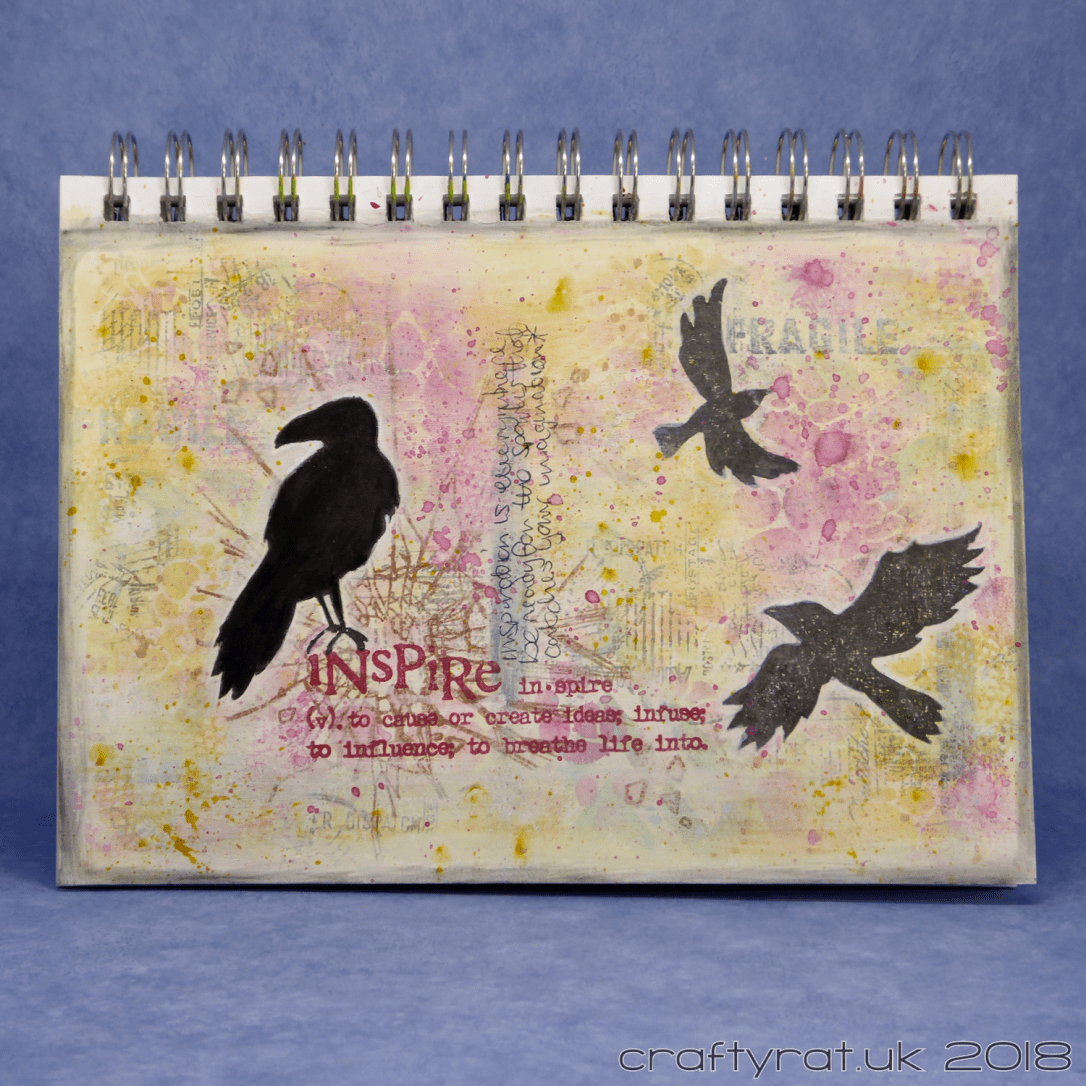
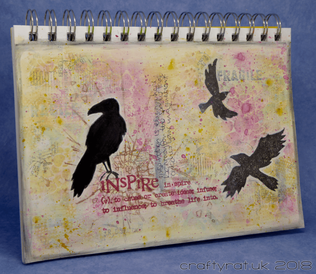
Another art journal page — I could get used to making these! It’s nice to have a single starting point, a few ideas, and no finished image in mind and then just see where the page takes you.
This one started with a bit of spare gesso left over from prepping another experiment: I didn’t want to waste it so I mixed in a bit of Distress stain for colour and covered a page in my mixed media pad.
I’d seen a video where someone used water to lift colour from gesso coloured with Distress and wanted to see how well it worked. It wasn’t a huge success for this project, you could see the difference, but the colours were too light for the effect to survive through the addition of any more layers.
But I had a starting point.

Next, I reached for my trusty stencils and added Distress oxide to the page. I finally managed to pick up some Tim Holtz stencil brushes so I tested them out on this — neither of the stencils I used was particularly delicate, which is where blending tools can cause problems, but I was impressed with how easy it was to fade the colour out from a strong centre point. I’ll have to do some more testing to update my blending tests post from last year.
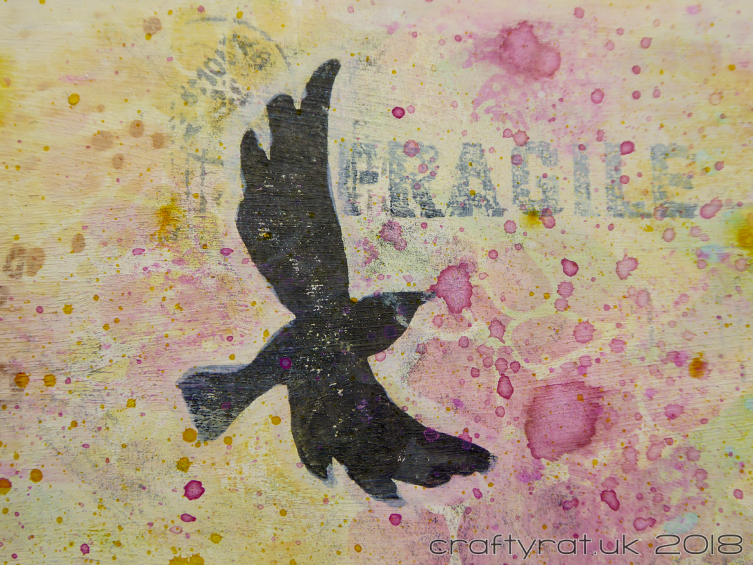
Then some stamping. I reached for my unused stamps pile and added the postal textures and the large fractured glass image.
And now it was all looking a bit too vivid, when my vague aim for this one was to be more subtle with the colours, especially after the bright journal page I did last time. So, I got out the gesso and selectively toned it down.
I did add some spatters with the Distress stain, but they almost faded away. I ended up adding some more splatters at the end with Distress paint instead.
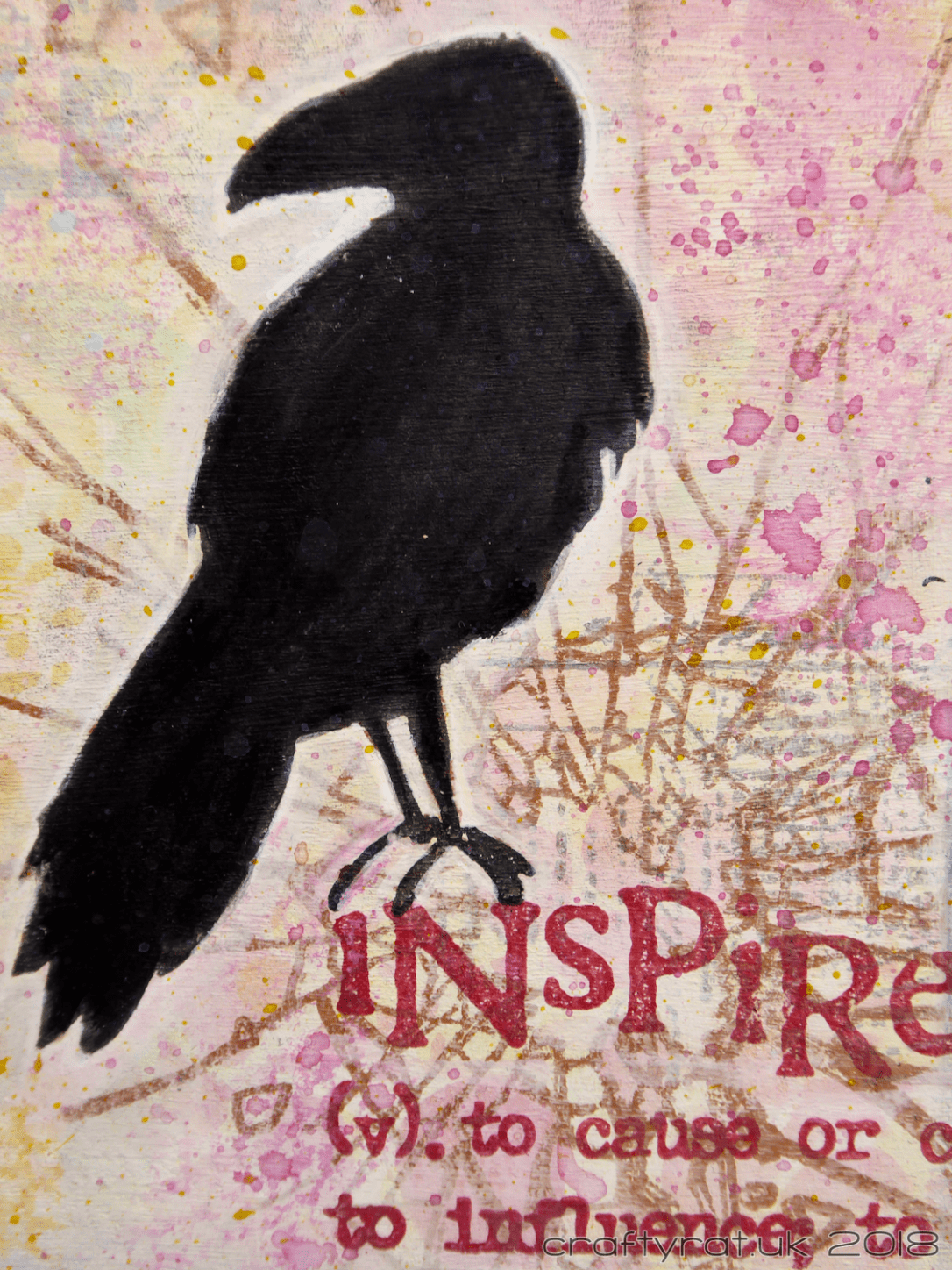
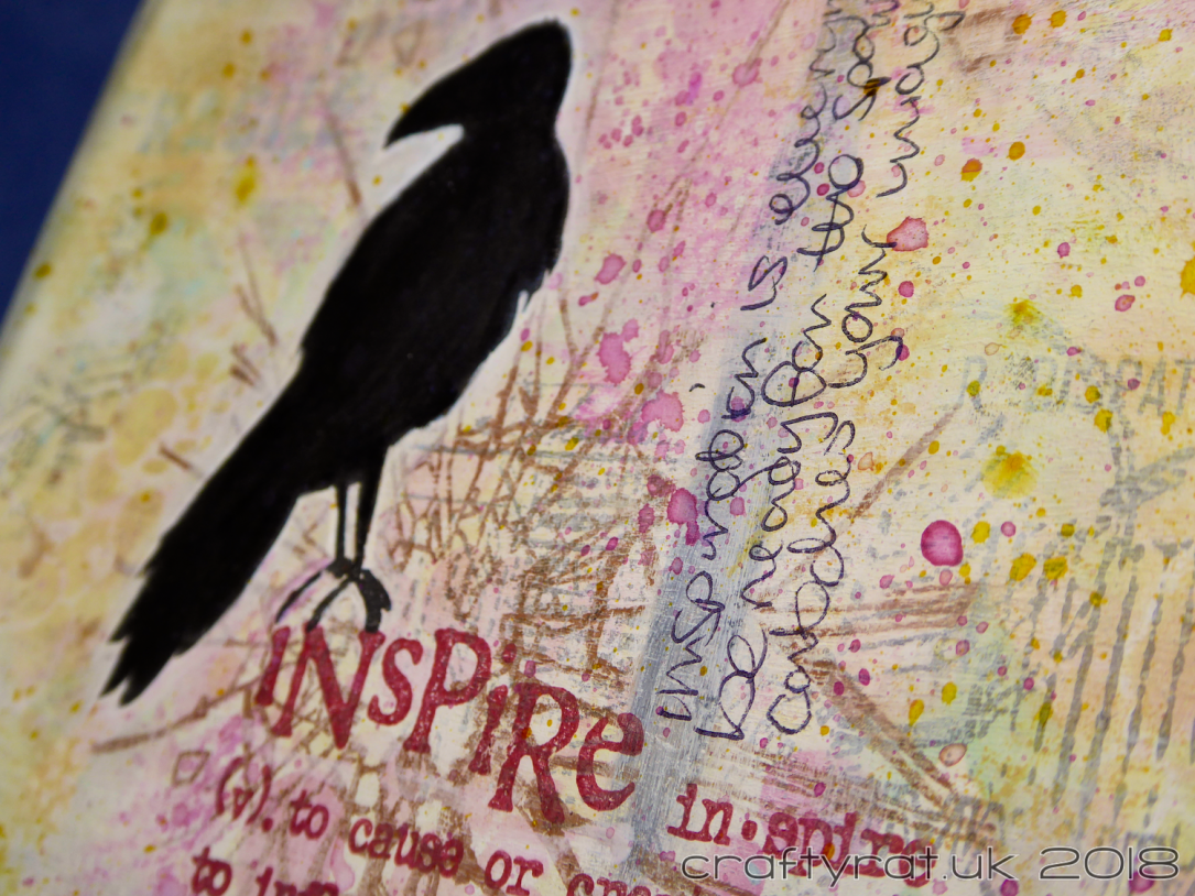
Once I was happy with the background I could add the focal pieces, starting with the “inspire” definition. Next, I stamped the ravens and outlined them in white. I wanted to differentiate between the main raven and the others, so I used a black Stabilo All pencil and a wet brush to intensify the black.
For the border, I smeared on some white gesso and then a thinner edge of black pencil to finish it off.
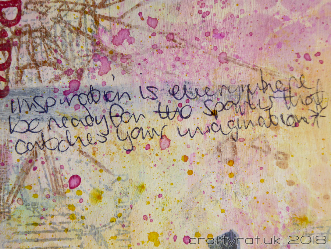
The last thing I did was to make it more journal-y by adding an extra-scrawly version of my horrible handwriting to it:
“inspiration is everywhere, be ready for the spark that catches your imagination”
Challenges:
- Country View Crafts – June 2018 – written word
Supplies:
- Prep & Stick:
Liquitex white gesso - Stamps:
Tim Holtz – ravens
Blue Fern Studios – postal textures
Visible Image – how fragile
Visible Image – imagine, dream, inspire - Colour:
Distress stain – wild honey, cracked pistachio
Distress oxide – wild honey, cracked pistachio, picked raspberry
Distress paint – mustard seed, picked raspberry - Inks:
Versafine – onyx black
Versafine – smokey gray
Hero Arts shadow ink – red royal
Ranger archival – sepia - Pens & Pencils:
Stabilo All pencil – black
Faber-Castell PITT artist pen – white
Discover more from Crafty Rat
Subscribe to get the latest posts sent to your email.

Love the bird silhouettes and the different types of text that you used here. Thanks so much for joining the Written Word challenge at CVC. Good luck and hope to see you again, Teresa DT xx
LikeLike
Another awesome creation! Love it!
LikeLike