After making the first piece of neurographic art, it wasn’t too long before I decided to make another.
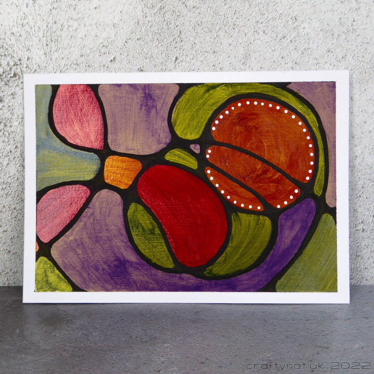
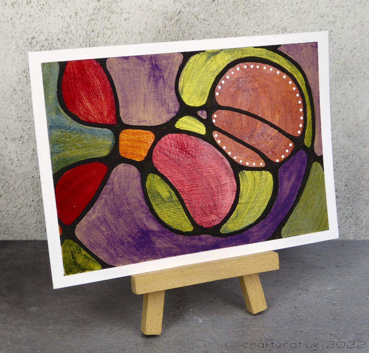
Curious about the effects of different coloured gesso, I’d treated myself to a pot of Daniel Smith’s iridescent gold acrylic gesso and prepared a couple of pieces of paper with no particular intent in mind. As they’d been sitting around unused for a while, I turned them into neurographic art.
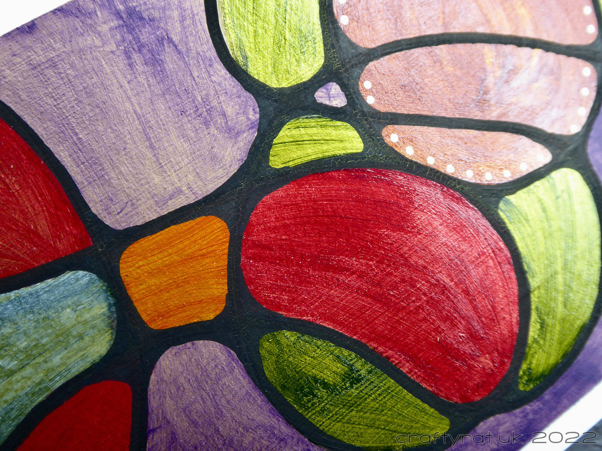
As soon as I started putting down colour I realised exactly how translucent some of the Golden fluid acrylics are. Extremely. Especially the ultramarine violet. Though it looks worse in photographs than it does in real life, another coat might have helped. I guess there’s also a bit of colour theory going on: the red and green are closer to the dark yellow of the gold on the colour wheel, whereas violet is the complement of yellow and was always going to fight against it.
Anyway, it was an interesting experiment which taught me more about my supplies. And now I’m pondering using neurographic art as an alternative to swatching colours. Swatching colours is useful but boring, colouring panels like this could be more appealing…
Discover more from Crafty Rat
Subscribe to get the latest posts sent to your email.

1 thought on “Neuro sun #2”