
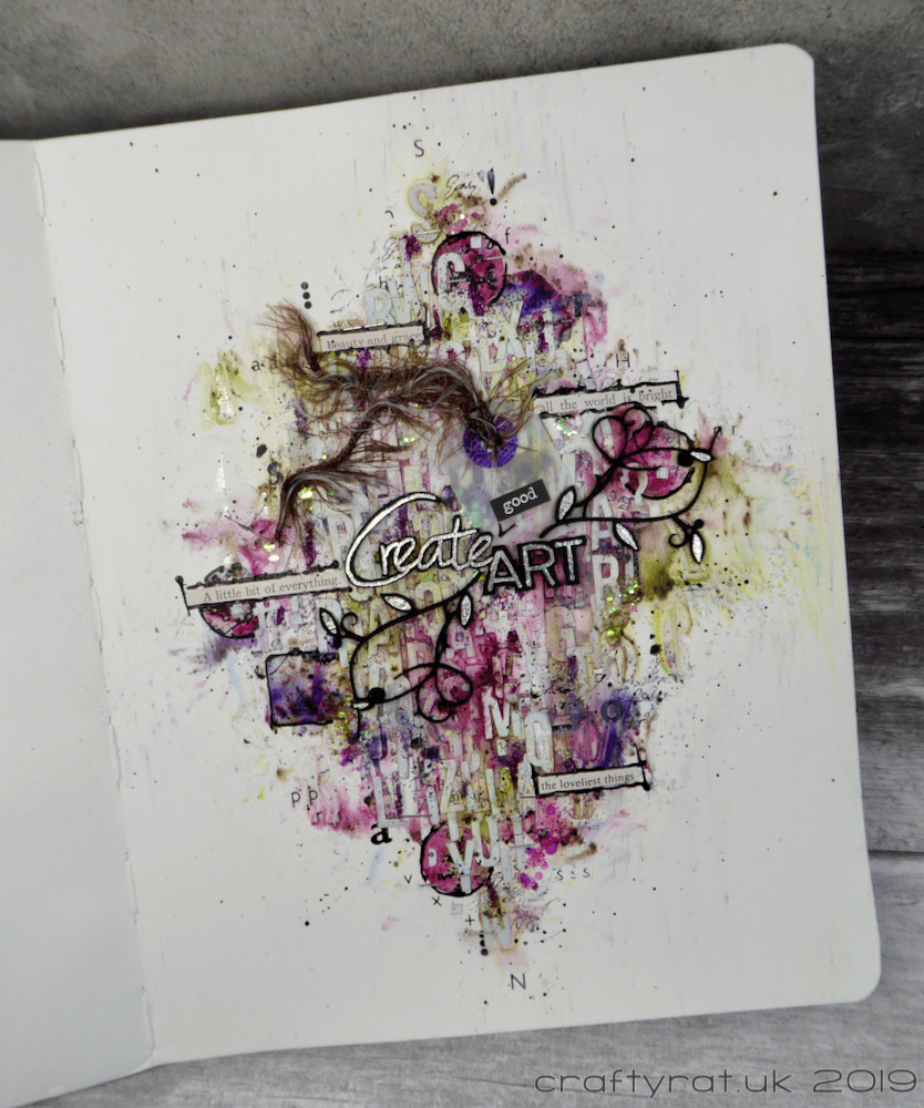
Week two of the “Typography” theme saw the arrival of the first of the year’s guest teachers: Athanasia Papantoniou (blog, YouTube).
This was an interesting layout to create. I am rubbish at leaving white space on pages, especially as much as this; the best I normally manage is to have some colour everywhere and then not add anything else in certain areas 🙂 But I am surprisingly happy with how this turned out.
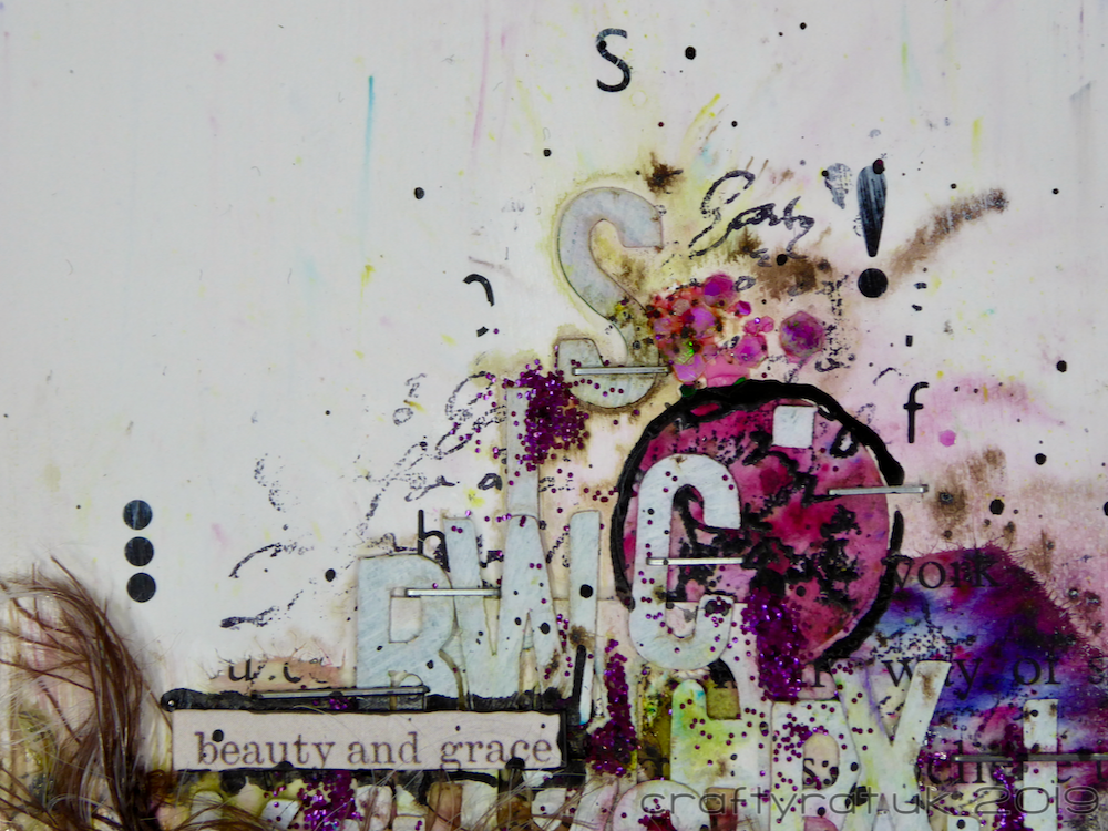
A lot of these classes are going to be exercises in substitution as much as anything else. I’m lucky, I have a wide and weird selection of supplies, but even so, there are some quite specific things used in some of the examples that will require some imagination. For example, Athanasia’s design used chipboard letters, but I didn’t have any of those (and I wanted to minimise the bulk in my journal anyway), so I had a dig through my stash, found a sheet of paper letter stickers, and used those instead. I even managed to find some very old Letraset at the bottom of a drawer for texture on the background.

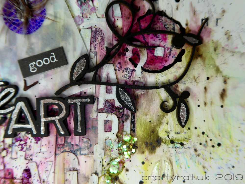
When I was looking for some text to use as a focal point, the only thing I had that was at all appropriate was this “Create ART” piece. It reminded me of Neil Gaiman’s instruction to “make good art” as a response to anything that life throws at you.
Class:
- Wanderlust 2019
(made in January 2019)
Discover more from Crafty Rat
Subscribe to get the latest posts sent to your email.

Pretty interesting! All the different items in this! Love it! Thanks for sharing!
LikeLike