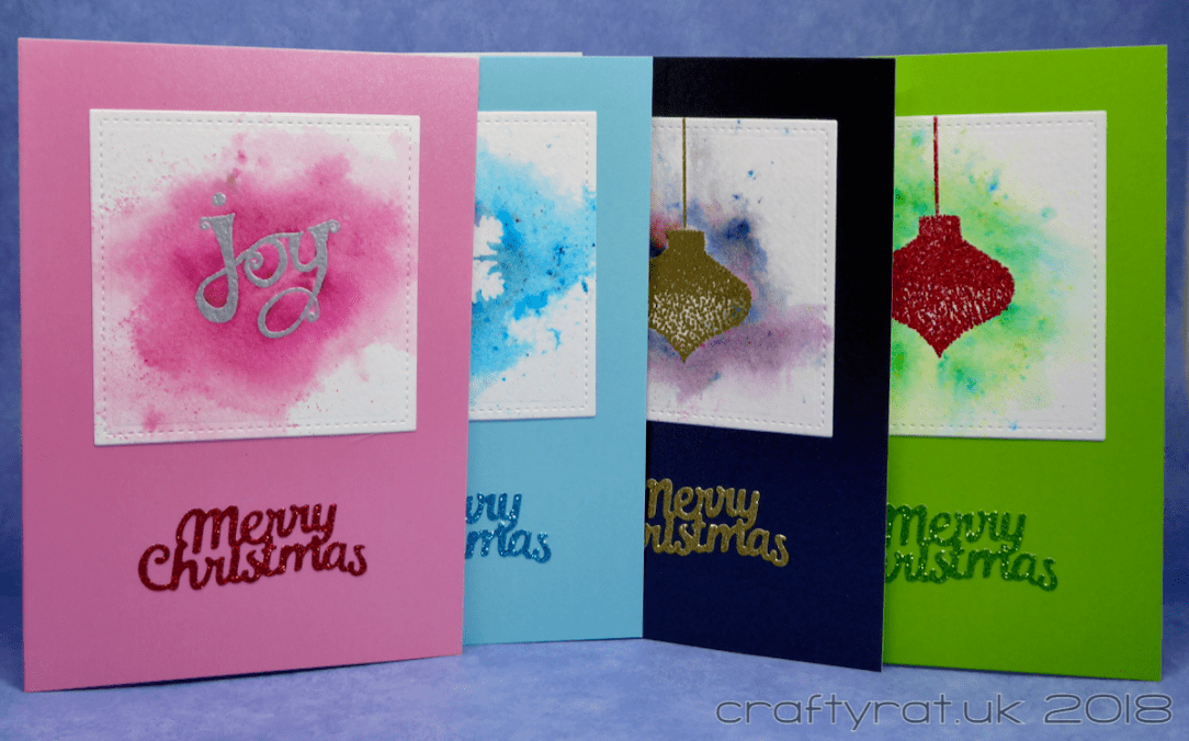
Another small batch of Christmas cards; unlike recent batches, these are not all identical, but they are made with the same techniques and layout.
I’ve used Brusho before, but mostly in the “add Brusho, spray with water and fingers crossed it looks okay” way. These were a bit more controlled. The technique was inspired by this post over at A Colored Mind and basically involves building up the colour in layers, blotting excess colour in between applications of pigment powder and water. Do go take a look at the video to see what a delicate effect she gets, far more subtle than I went for this time.

I could have created something similar, with the tiny tree — and I was tempted because it is a lovely design — but I would rather take a technique and apply it to my own design.
So I grabbed some simple solid Christmassy stamps, a selection of embossing powders and most of my pigment powders (a mixture of Brusho and Paperartsy Infusions) and set to work.

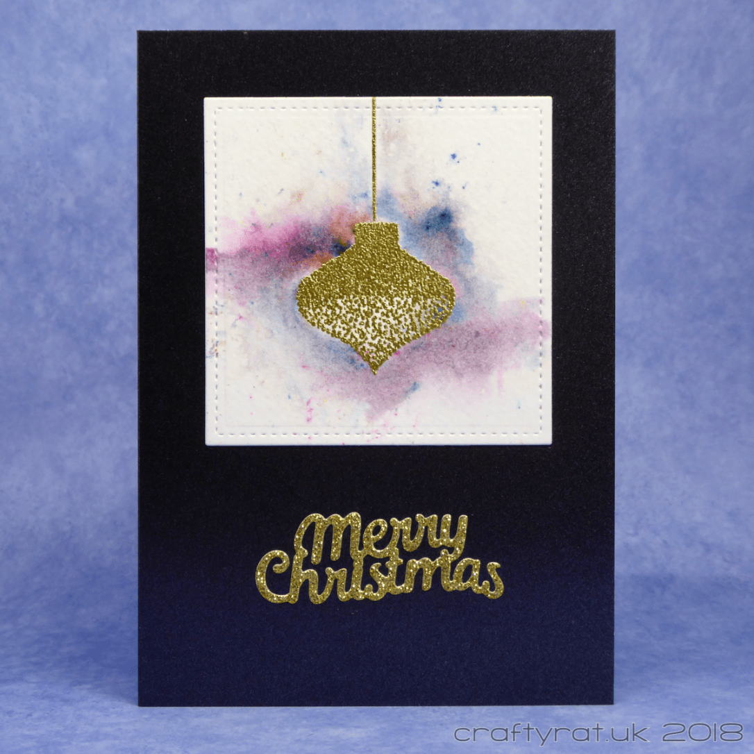
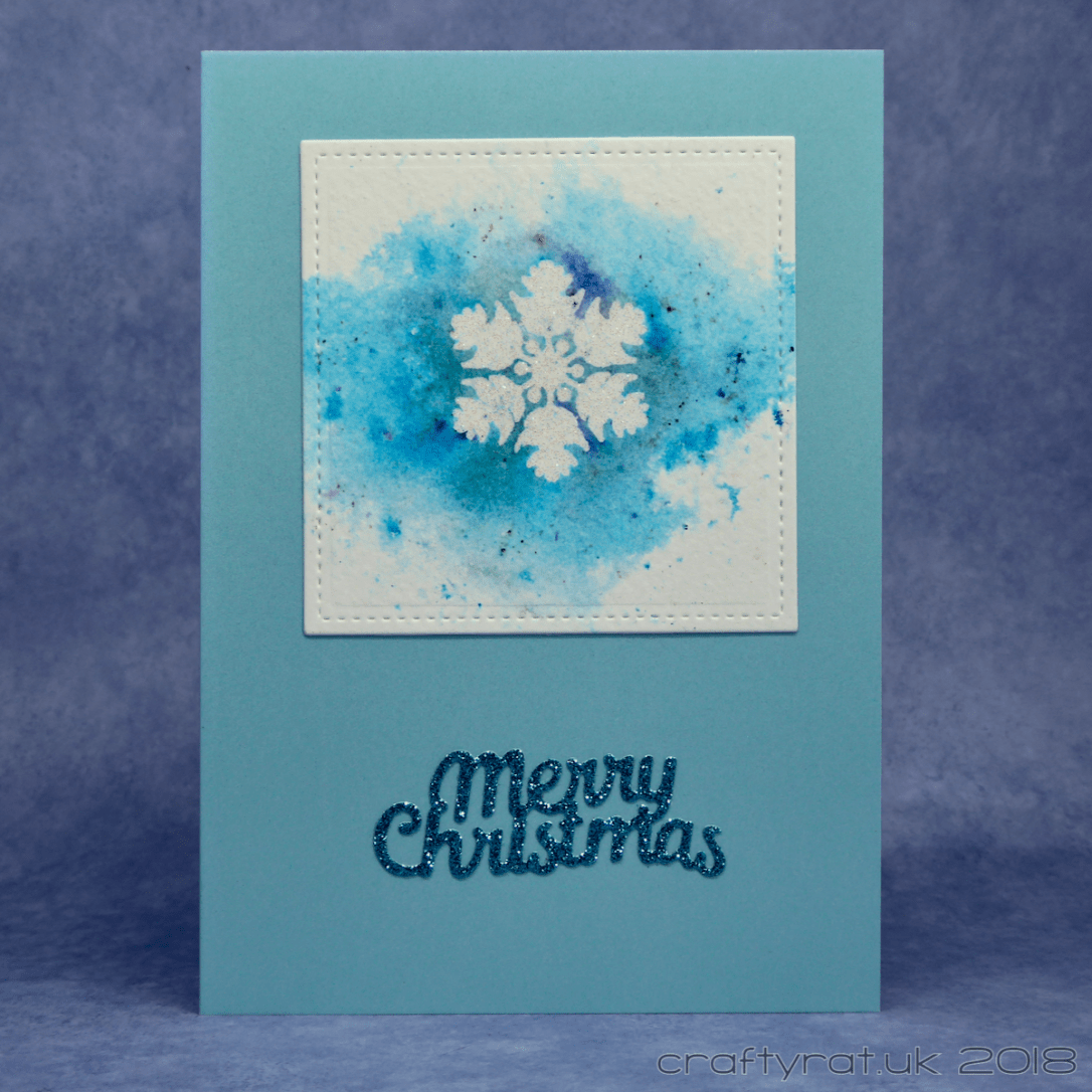
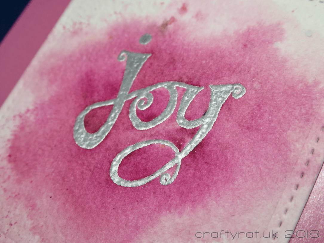
After heat embossing the baubles and bits, I started building up the colour: tapping the pigment straight from the bottle is too uncontrolled and you will almost certainly end up with too much colour in all the wrong places. A small brush is far more precise: you can either take the lid off the bottle (though that gives me visions of pigment powder spilled everywhere) or tap some powder onto a palette and work from there. Add in a fine spritzer and a supply of tissues and you can create as much or as little colour as you want.

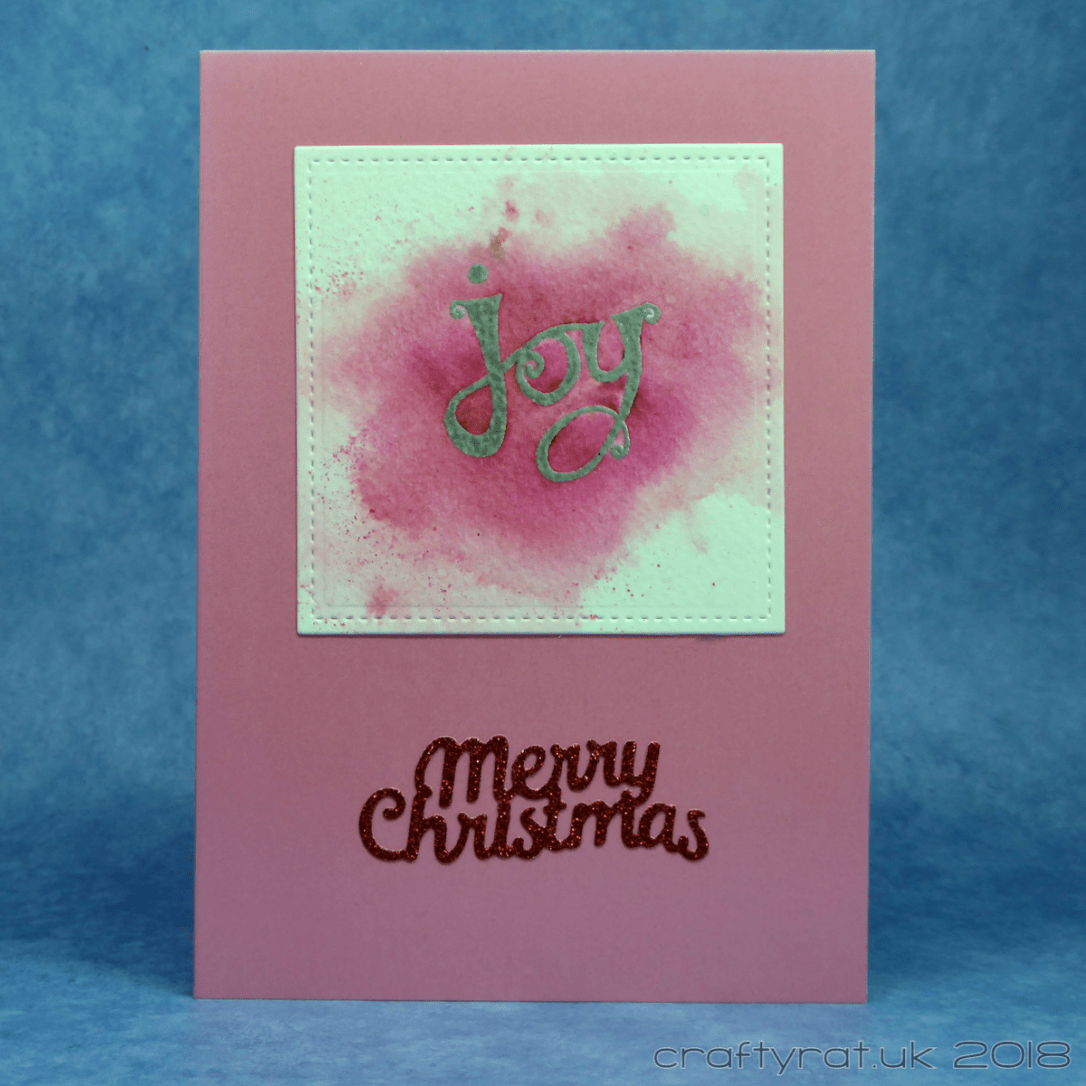
To my mind, the nicest effect is got where there is a good amount of colour variation in the powders. The pink is the least effective because it all ends up being a similar pink in spite of using a couple of different powders. It’s still pretty, just not as interesting.

Once everything was dry, I die-cut them with a stitched square, mounted them on a matching coloured card base and added a simple glittery die-cut sentiment.
Oh, almost forgot… I also put a light coat of Distress micro glaze over the pigment powders. It doesn’t change the appearance but it does help stop the powders reacting with water if they happened to get damp at all, say, if they get delivered on a particularly rainy day…
I do like the embossing and pigment powder effect and it’s one I will definitely use again. I’m not really happy with the card layout though, but I do have to keep telling myself that they are simple Christmas cards, I can’t spend hours designing each card individually, whoever gets them will probably like them, and if they don’t, well, tough 🙂
Supplies:
- stamps:
Polkadoodles – winter flurries (bauble)
Polkadoodles – snowflake garden (snowflake)
Craft Stamper – joy - dies:
Tonic Studios – wave merry Christmas
Lawn Fawn – stitched square stackables - colour:
Brusho – black, scarlet, brilliant red, turquoise, yellow, emerald green
Paperartsy Infusions – royal blood, are you cerise - inks:
Versamark - embossing powder:
Judikins – detail silver, detail gold, iridescent sparkle
Papermania – tinsel red - paper and card:
Canson Montval watercolour paper
Hunkydory Adorable Scorable pearly shimmer
Papermania glitter card - miscellaneous:
Distress micro glaze
Discover more from Crafty Rat
Subscribe to get the latest posts sent to your email.

Oo I love these, so pretty with the brusho background and the embossing. I might need to have a play with this effect. Thanks for sharing x
LikeLiked by 1 person
I’m so pleased to have found a more subtle, controlled way of using Brusho and it really works well with the heat embossing. I’d love to see what you do with the technique!
LikeLiked by 1 person
Those are so pretty! Thanks for sharing!
LikeLike