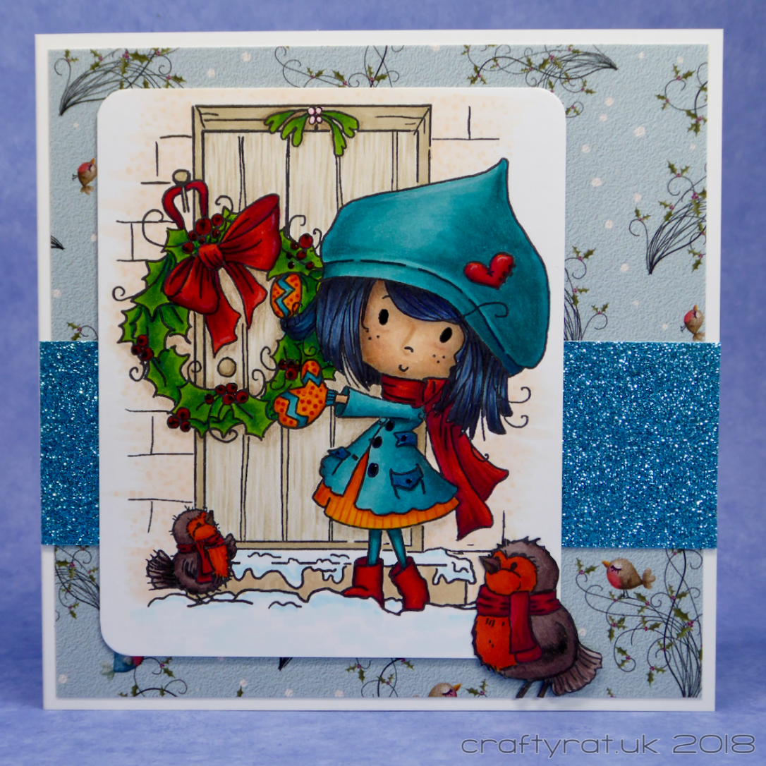
I picked up this clear stamp in the run-up to last Christmas, but I never got around to using it. I rarely buy “scene” stamps — I generally prefer to build my own scenes — but I thought this was cute.
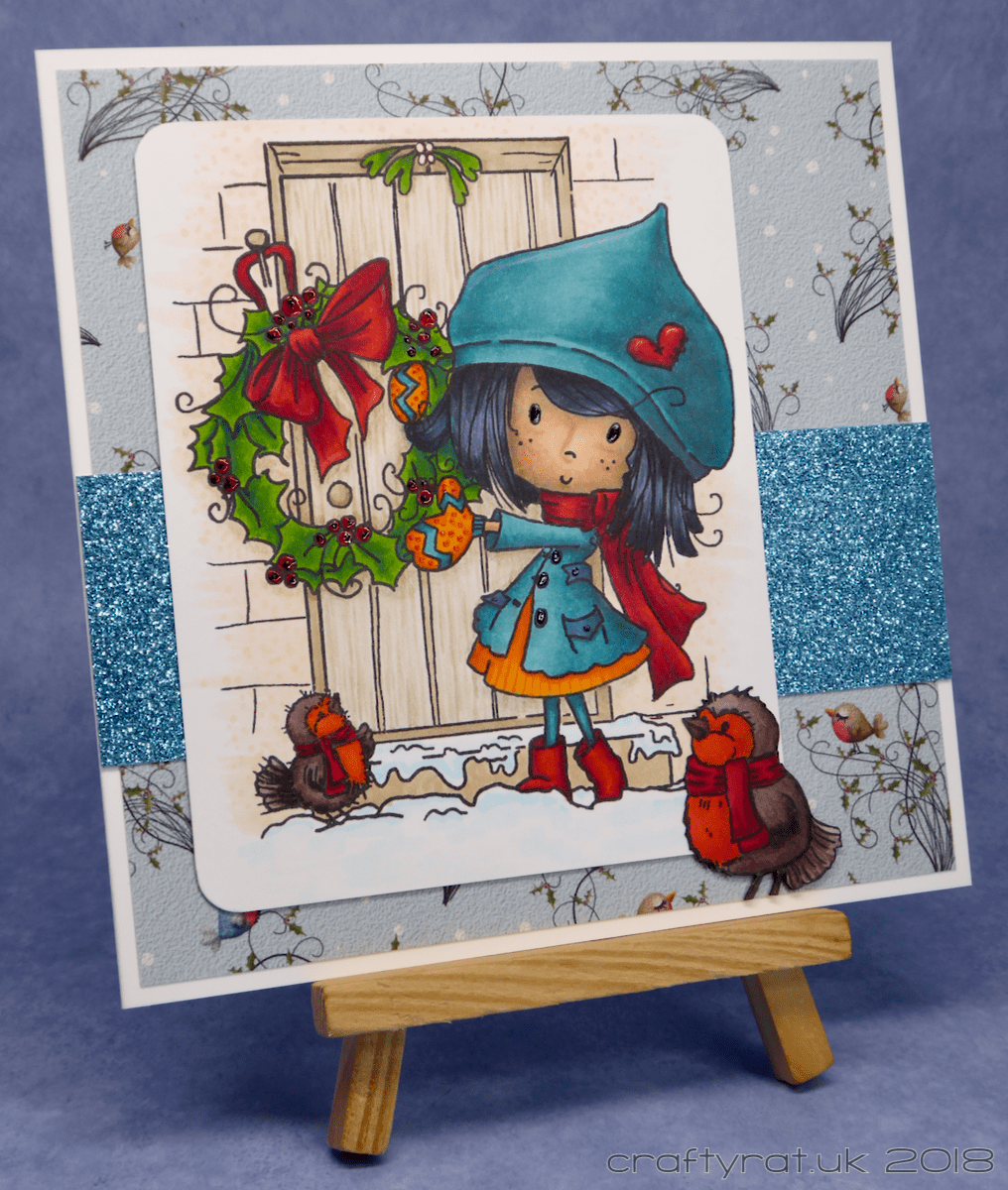
The card layout is simple: a layer of matching patterned paper, a strip of glitter card, the main image, and an extra robin on top.
I could leave the card description there, but this is quite a good image to talk about colour choices. Now, I am not a natural at choosing colours; I can be of the opinion that there are both too many colours and not enough at the same time, and the main reason I get full sets of pencils and markers is that I am rubbish at selecting colours.
So, how do I pick a colour scheme for something like this?
Start with the simple bits. The birds are robins, so they are brown and orangey-red. The wreath looks like holly, so green leaves and red berries, and we’ll avoid making it too fussy and colour the ribbon red as well. There’s going to be some strong colours in the foreground and keeping the background muted will provide some balance and allow the foreground to pop.
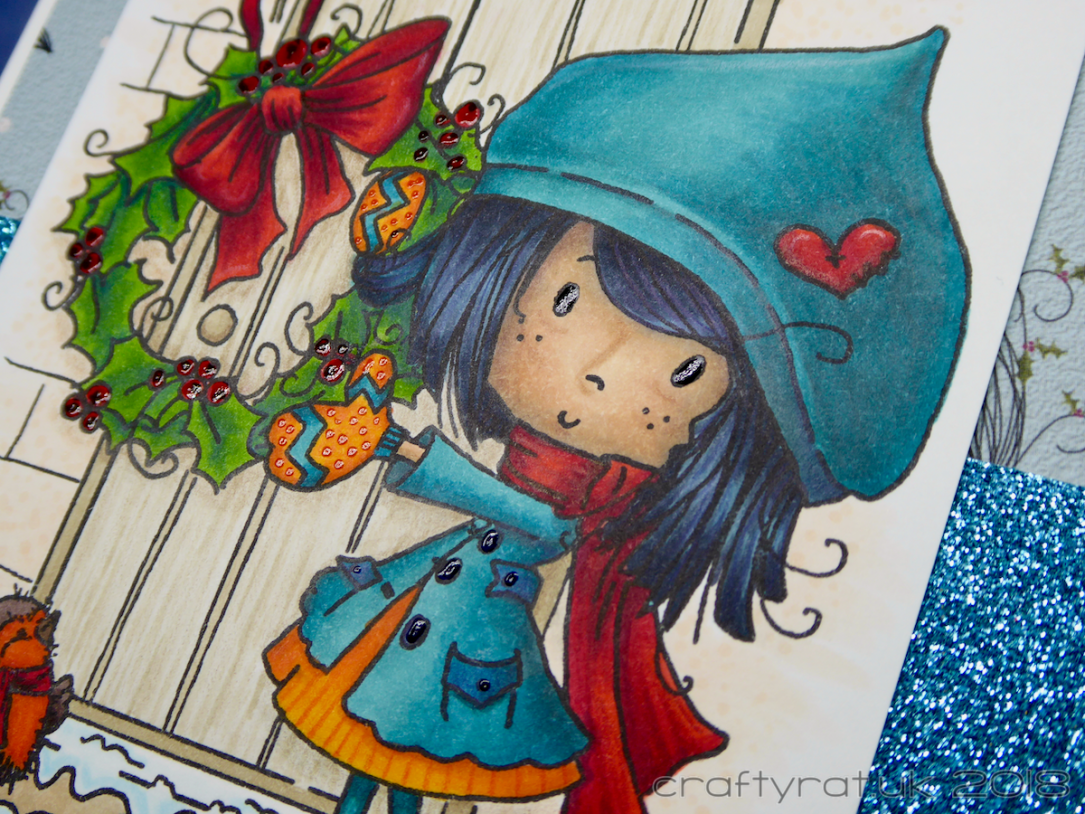
At the moment I am working on keeping my colour palettes simple, avoiding throwing all the colours at a single image. I decided to have teal as the main colour for the girl and used it for her hat, coat and tights, oh, and the stripes on the mittens; this is probably the most successful Copic teal combo I’ve put together, though it still took a bit of work getting the blending on the hat right. I had used red for the scarves on the robins and the bow on the wreath so I continued that through to her accessories: scarf, boots and the heart on the hat.
I did her hair in a blue-green-based black because it matches her coat and hat and is dark enough to set off her face nicely. Blonde and brunette would have taken the focus off her face and, although I’m enjoying colouring red hair at the moment, there’s enough red in the scene already.
That left the dress and the mittens. All the colours so far are relatively dark and intense so I needed something to lift it a little without clashing. At times like these, it can help to refer to a colour wheel (I have a small one pinned above my craft desk). Blue-green is the main focal colour here, opposite that on the wheel is red-orange; I’ve already got red in the scene so adding orange would give me a split-complement colour scheme. And that’s what I did and I’m really happy with how it worked out.
I added a few details and some extra shading with my coloured pencils. I also went over the buttons and berries with gel pen and added dots on the mittens just to finish it off.
Copic markers:
Winnie:
skin – BV01, E11, E33
hair – BG57 (base), C10, C8, C5
dress/mittens – YR18, YR68, Y38
hat/coat – BG57, BG09, BG78
scarf/boots/heart – R59, R29, R17
wreath:
leaves – YG17, G28
berries – R29, R17
scene:
door – E40, E42, E43
wall – YR000
snow – B00, B0000
robins:
scarf – R29, R59
breast – Y38, YR68, YR18
feathers – E49, E77, E74, E71
Polychromos pencils:
skin – 169 caput mortuum
hair – 247 indanthrene blue
hat/coat – 158 deep cobalt green
dress – 117 light cadmium red
bow/scarf – 225 dark red
highlights – 101 white
door – 178 nougat
Supplies:
- stamps:
Polkadoodles – Winnie Christmas wreath - inks:
My Favorite Things – hybrid – black licorice - pens:
Sakura Glaze – black, red, orange - paper and card:
Neenah solar white 216gsm
Hunkydory Adorable Scorable – cotton white
Polkadoodles – patterned paper – heartfelt Christmas
Papermania glitter card - miscellaneous:
We R Memory Keepers corner chomper
Discover more from Crafty Rat
Subscribe to get the latest posts sent to your email.

What a cute card! Beautiful coloring! Thanks for sharing! 🙂
LikeLike