The start of July brings the twins’ birthdays, meaning it was time to come up with another idea for a cleverly linked pair of cards. Once again, my other half gave me a starting idea: something as simple as “an image that flows from one card to the other”. And that sent me off to browse through Google image results for “landscape diptych” looking for inspiration.
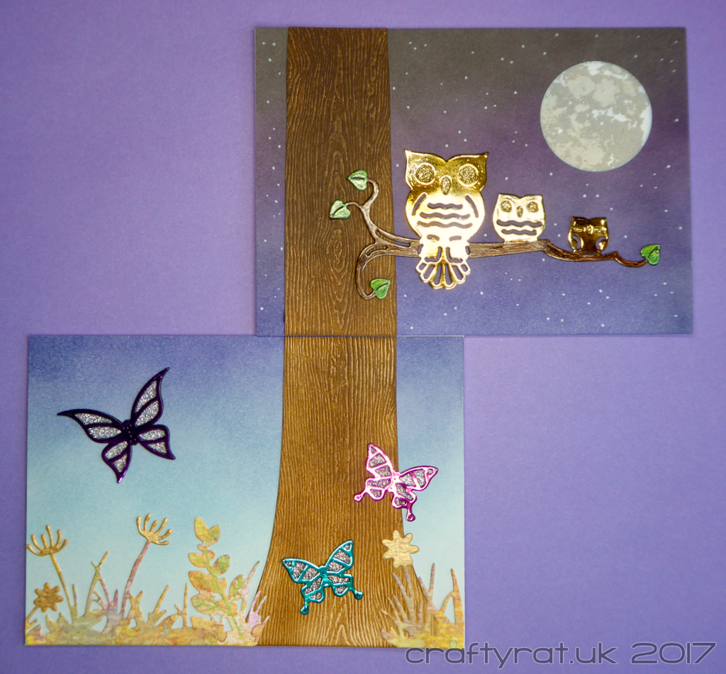
I wanted something that wasn’t just one picture split into two, but something that used the diptych format to create two different-but-linked images — and found this pair of paintings which creates two separate offset windows onto the same landscape. I flipped the layout around, stacking my images vertically and using the tree trunk as the linking element.
Then came the idea of fading from day into night to complement the foiled die-cut focal elements — the butterflies and owls. To ensure that the gradient flowed smoothly between the cards, I created one large light to dark blend and cut it in half. Luckily the Strathmore is really forgiving for blending Distress inks, but even so my arm was aching by the time I’d finished that large a six-colour blend!
The tree was hand cut from woodgrain cardstock and also given a night to day gradient.
I chose the watercolour foil to give a nice bit of variety to the owls, but I wanted to differentiate between the owls and the branch, so I carefully positioned bits of foil covering the owls and then laid some white foil over the top for the branch. Once it had cooled down I used my Copics to add some colour and texture to the branch and leaves.
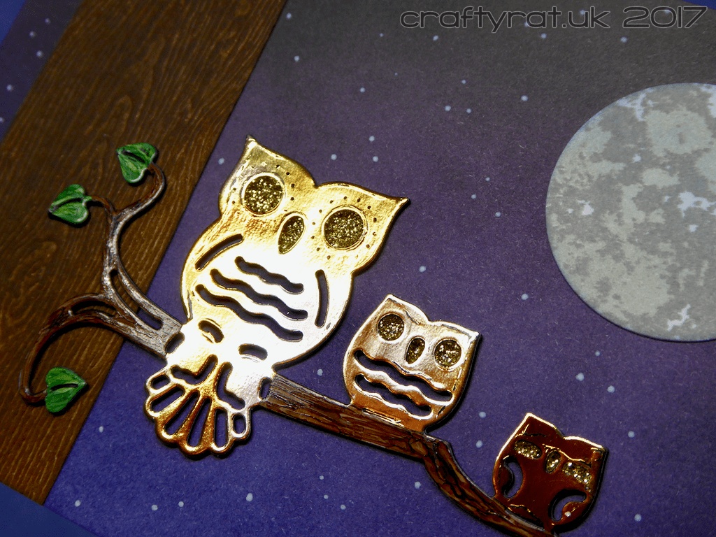
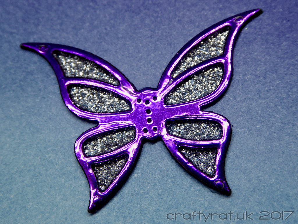
The inevitable bit of shine came from using detail sparkle in gold to fill in the owls’ eyes and in silver for the butterfly wings.
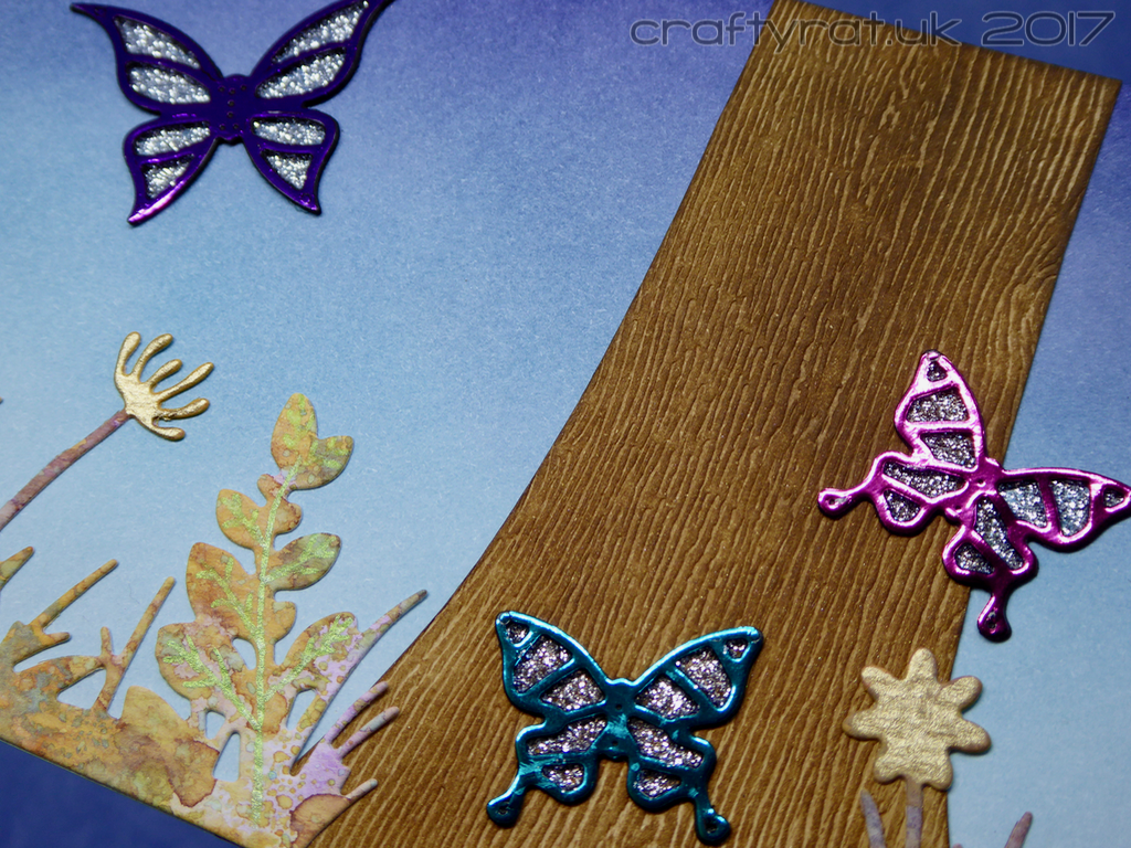
The other thing that these cards have in common is that they both use bits from my PHD box. The moon (cut down slightly to fit the card better) is from a series of moons I made ages ago to test different ink layering combinations. The dandelion border was a Distress oxide test piece that I die-cut and played around with, adding details with shiny pens.
My other half also suggested cutting down the back part of the card base so that, when opened out and lined up with each other, the two cards would form a rectangle.
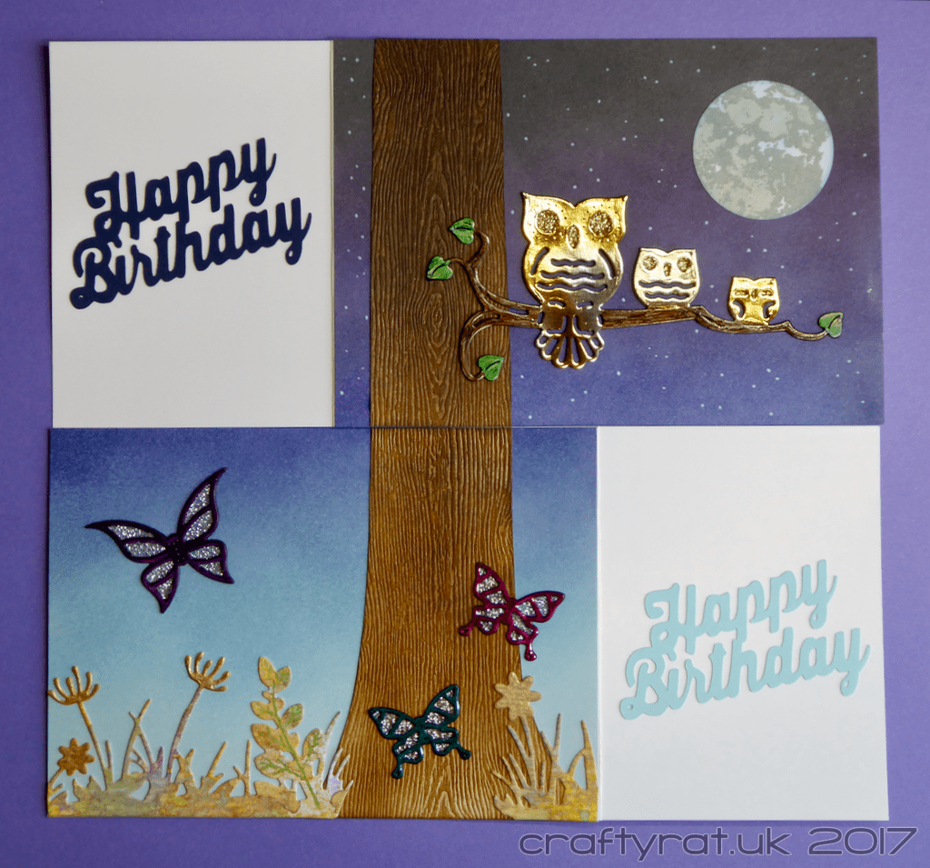
It’s always pleasing when the finished cards actually look like your original idea and you actually like it! My absolute favourite individual bit has to be the purple foil butterfly though…
Supplies:
- stamps:
Altenew – to the moon - dies:
Joanna Sheen – owl family
Joanna Sheen – butterflies and dragonfly
Fuzzy Lemon – dandelion border
Sizzix – circles 2 - pens:
Uni-ball Signo UM-120 AC white - Distress Ink pads:
sky – tumbled glass, broken china, stormy sky, chipped sapphire, dusty concord, black soot
tree – vintage photo, walnut stain, gathered twigs, ground espresso - sparkle:
Imagination Crafts – detail sparkle – silver gilt, gold gilt - foil:
Deco Foil – peel n stick toner sheets
Wow! Fab Foil – white
Deco Foil – amber watercolour
Deco Foil – purple
Heidi Swapp – hot pink
Heidi Swapp – teal - Copic markers:
branch – E49, E47
leaves – G29, YG67 - paper and card:
Tim Holtz – Distress woodgrain cardstock
Strathmore smooth 300
Hunkydory adorable scorable – cotton white
Discover more from Crafty Rat
Subscribe to get the latest posts sent to your email.

Oh these cards are great! I love how one flows to the other! Great idea! I’m sure the twins will love them! 🙂
LikeLiked by 1 person
Absolutely genius! I don’t think I’d ever think of anything quite so clever. No wonder you are really happy with it – that purple butterfly is so pretty! xx
LikeLiked by 1 person