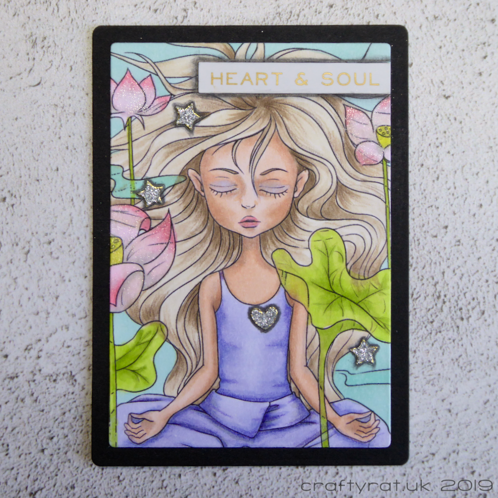
Series: The Daily Marker Art Card #12
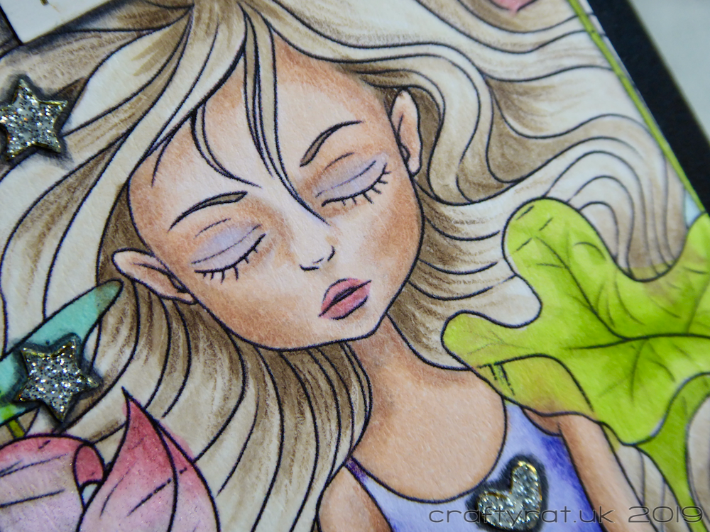
I have a tendency to end up with a lot of contrast and strong colours when I’m colouring on auto-pilot with my Copic markers: the rabbit in the rain is a good example. Don’t get me wrong, I do love that style of colouring, it’s just that some subjects call for a more subtle approach.
This is one such image — a calm scene with translucent lotus flowers and leaves floating over the top of the meditating girl — so I put down the dark markers and aimed for a more delicate feel. I think it worked quite well.
Copic markers:
skin – E00, E21, V20
hair – E41, E42, E43, YR30
clothes – BV02, BV31
flowers – RV21, RV000, W1, Y04
leaves – YG01, YG03
background – BG10, BG11
Polychromos pencils:
skin – 189 cinnamon
hair – 177 walnut brown, 178 nougat
clothes – 137 blue violet
Supplies:
- digital stamps:
The East Wind – Aurora what matters - dies:
Marianne Design – ATC - pens & pencils:
Stabilo All graphite - embellishments:
Tim Holtz Idea-ology – metallic stickers – quotations
Forever in Time glitter foil silhouette stickers – pennant garlands 2 - paper and card:
Neenah Solar White 216gsm
black card

This image was coloured for day 12 of The Daily Marker 30 Day Colouring Challenge on 26 June 2019
Discover more from Crafty Rat
Subscribe to get the latest posts sent to your email.

I love the softness of the color! I, too, seem to color a little darker than I want. I often try for softer pastel colors and end up with bold coloring. Love this!
LikeLiked by 1 person
I blame Sandy Allnock 🙂 She taught me not to be afraid of contrast and going darker in the shadows and I took it to heart 🙂 I had to choose the markers I was going to use before I started and stop myself from going back for more – it would have been so easy to end up with bold colours again…
LikeLiked by 1 person
This is such a pretty and calming image. Great work. ^^
LikeLiked by 1 person
Thank you! I am really happy with how it turned out.
LikeLike