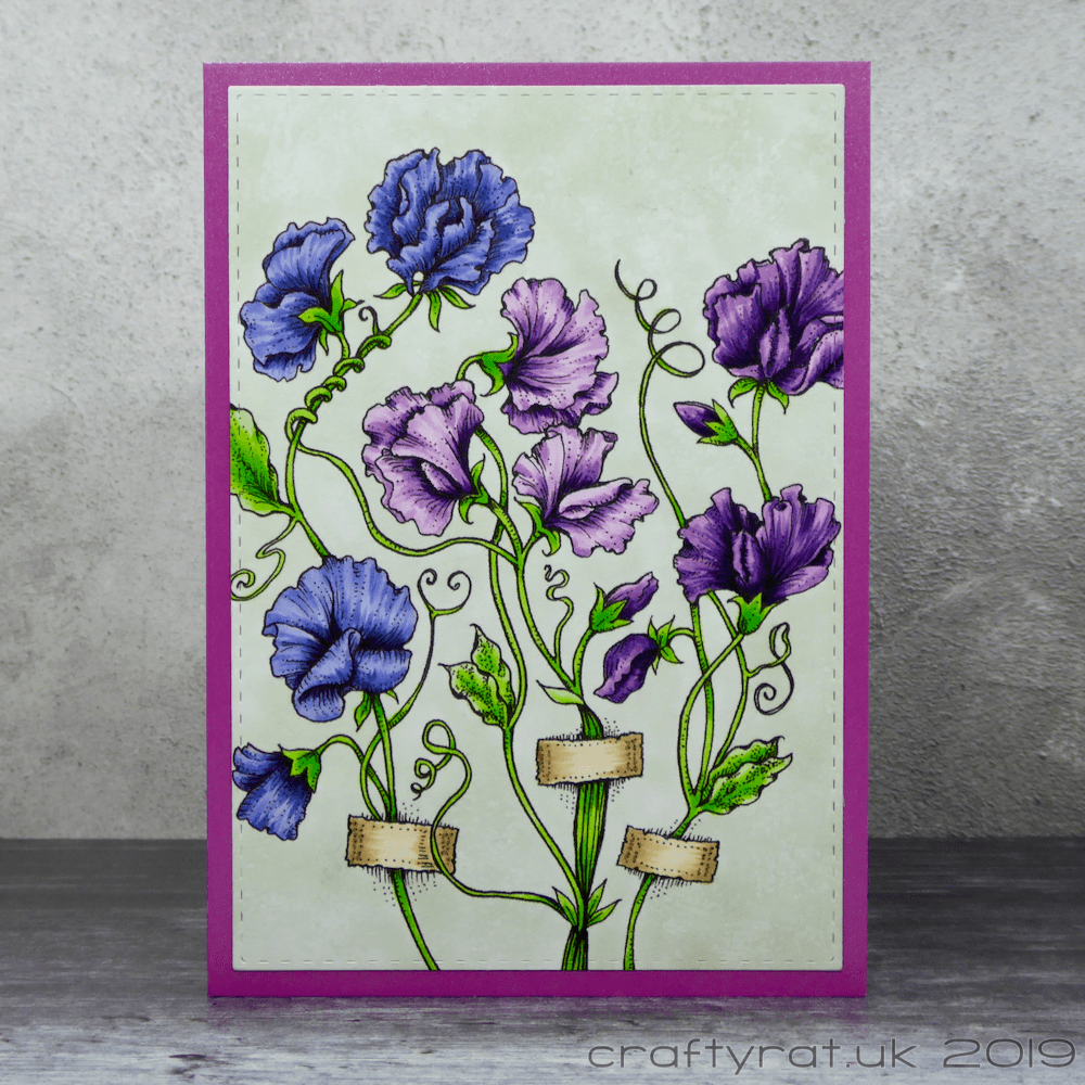
I’m always happy to have an excuse to colour Power Poppy flowers; I chose these pretty sweet peas for my brother’s girlfriend’s birthday earlier this year.
Like all Power Poppy images, this is so beautifully drawn that it’s easy to get a good result. The background was more of a challenge. I could have left it plain, but I wanted a softer feel to the card and that meant losing the bright white.
It’s hard to get smooth coverage over comparatively large areas with a single colour, especially when you are working around details that have already been coloured. So I didn’t really bother trying too hard, other than to avoid harsh lines. Instead, I added even more texture by lightly dampening a piece of natural sponge (the sort often sold for use with watercolours) with colourless blender refill and dabbing it over the background. The finished effect is subtle but reminiscent of stucco.
If I’d known that I was going to do the background like this before I started, then I would have done it first. That way it would have been easier to add the texture and I wouldn’t have had to be so careful adding the base colour around the stems. But that would have required having a plan…
I decided against cluttering up the image with a sentiment and just die-cut it out and mounted it straight onto a card base instead.

Copic markers:
purple flowers – V01, V12, V15, V17, V09
blue flowers – BV02, BV13, BV04, BV17, BV08
dark purple flowers – V12, V15, V17, V09, BV08
green – YG11, YG05, FYG2
straps – E51, E31, E55
background – BG90, 0 on natural sponge
Supplies:
- digital stamps:
Power Poppy – sweet pea show - dies:
Create A Smile – double-stitched rectangles - paper and card:
Neenah Solar White 216gsm
Hunkydory Adorable Scorable pearly shimmer

Discover more from Crafty Rat
Subscribe to get the latest posts sent to your email.

Awesome card! Beautifully colored!
LikeLike