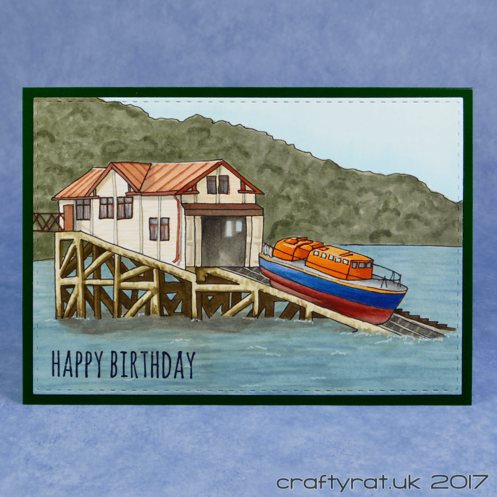
I always try to match cards to their recipients as much as I can. So my mum gets cute critters and flowers, my other half gets something a bit geeky, his sister gets bunnies, and we seem to be developing a South Wales theme for his dad. Last year I did a picture of Port Talbot docks; this year it’s the Mumbles lifeboat.
I’ve never been particularly good at drawing, so I had to come up with another way of creating the base sketch. My process goes like this:
- Find a photo that I want to work from.
- Resize it to fit on a card and print on regular copy paper.
- Using the lightbox and a clean sheet of copy paper over the print, do a first pass at picking out the outlines needed.
- Refine the sketch, referring back to the original image.
- Trace the final version of the sketch onto a piece of Neenah using Copic multiliner.
- Colour!!!
Even the colouring is different to the usual. For a start it’s an exercise in choosing colours that are a near match to the original image rather than just picking ones I like. And with these sorts of images there’s less emphasis on blending (with the exception of the boat) and more on creating textures.
It’s fun to do something so different to my usual style for a change.

Supplies:
- stamps:
Tim Holtz – crazy talk (sentiment) - dies:
Create A Smile – double stitched rectangles - inks:
Ranger – archival – jet black - pens:
Copic multiliners – black, sepia – 0.1, 0.3
Uni-ball Signo UM-120AC white - Copic markers:
lots and lots - paper and card:
Neenah solar white 216gsm
Hunkydory Adorable Scorable - miscellaneous:
MiniSun A4 LED LightPad

Discover more from Crafty Rat
Subscribe to get the latest posts sent to your email.

Your colouring looks great, especially the water! What a unique card 🙂
LikeLiked by 1 person
Thank you! I left the water till last because I wasn’t sure how I was going to do it, but it’s my favourite bit too.
LikeLiked by 1 person
Water is always a tricky thing to colour – I always want to add water to my drawings but never do because I can just never get it to look right!
LikeLiked by 1 person
I keep two things in mind when I’m doing background textures… “keep working at it” because “it’ll look awful until it doesn’t”. There’s always a point where I’m convinced it will never look good, but I keep going, because at some point it suddenly starts to work. This water is basically lots of fairly short lines in probably four different blues and, once I’d got good coverage, I just added a light coat of one to start slightly blending the lines, bringing it all together. It is scary though, especially when you’ve coloured everything else first 🙂
LikeLiked by 1 person
I really need to remember that! That’s why I have so much trouble with using my watercolours especially because whatever you’re doing tends to look pretty bad for most of the time you’re working on it until you just cross that point of everything coming together to look nice!
LikeLiked by 1 person
Oh, don’t get me started on watercolours… I love the look, but really haven’t figured out how to use them. I’ve watched the videos, I know the theory, but in practise… It’s doubly annoying because I have two watercolour landscapes on my wall that I did years and years ago, just copied out of a book, which worked really nicely 🙄
LikeLiked by 1 person
Oh what a great card! I’ve never tried a light box….been experimenting using a photo and Photoshop to create an outline with a few detail lines…a work in progress. Beautifully made! 🙂
LikeLiked by 1 person
Thank you! I’ve tried doing it on the computer, but I haven’t found a method that works reliably for me yet. I have tried using a “sketch” or “find edges” filter to simplify the source before printing it out and that works well with some images.
LikeLiked by 1 person
Thanks for the tips!
LikeLiked by 1 person
I think i saw this card on IG before i got the email, and I thought WAOH! very realistic looking, brilliant colouring!
LikeLiked by 1 person
Thank you! And yes, everything gets posted on Instagram as soon as I’ve made it and then I post it here when I get round to taking photos and writing it up.
LikeLike