
I recently watched a review on YouTube comparing blending tools and I was so appalled at the results they were getting with the Ranger blending tool and Distress Oxides that I had to stop and go have a try — I have some oxides, but I hadn’t tried blending them yet…
I am by no means an expert at blending Distress inks, especially not the Oxides, and I was using new foams with them, which don’t pick up a lot of ink until they’ve been worn in a bit. I was using Neenah solar white to match what they were using for the review (my preferred paper for blending Distress is Strathmore Bristol smooth as the ink sits on the surface for longer, making it easier to blend). So, far from ideal conditions, but…
Distress Oxides with blending tools on Neenah
The oxides are a much heavier ink than regular Distress, so more than ever, you absolutely must start out blending with a very light hand. Loading the foam with a lot of ink and pressing, I was going to say “heavily”, but really pressing at all will leave you with the outline of the foam on the cardstock and it will be really hard to smooth it over. Don’t overload the foam, start off the card, and glide the foam across the surface of the paper. Once you have a base layer of ink, then you can be a bit more enthusiastic and build up the depth of colour.
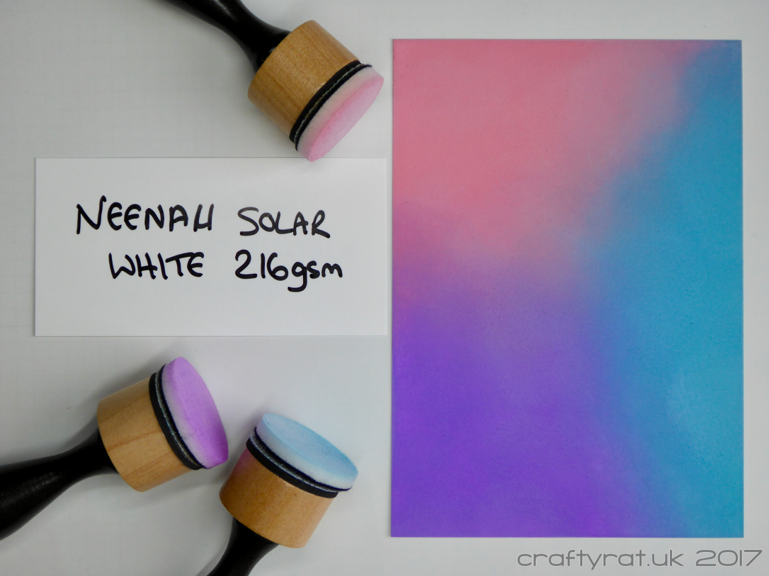
I wouldn’t even try to get an even, light coat of Distress Oxide using a foam tool; at least not on Neenah.
Distress Oxides with Clarity brushes on Neenah
This is also the first time I’ve used the Clarity brushes with Distress Oxides and I’ve only played with the brushes a handful of times with other inks. It would also have been easier if I had been doing stripes across the card rather than blobs meeting in the middle…
But even so, with a light hand to start off, I managed to get a lighter, reasonably well-blended version of the blending tool panel. The finish does have quite a lot of texture to it, but that’s down to the cardstock, not the brushes.
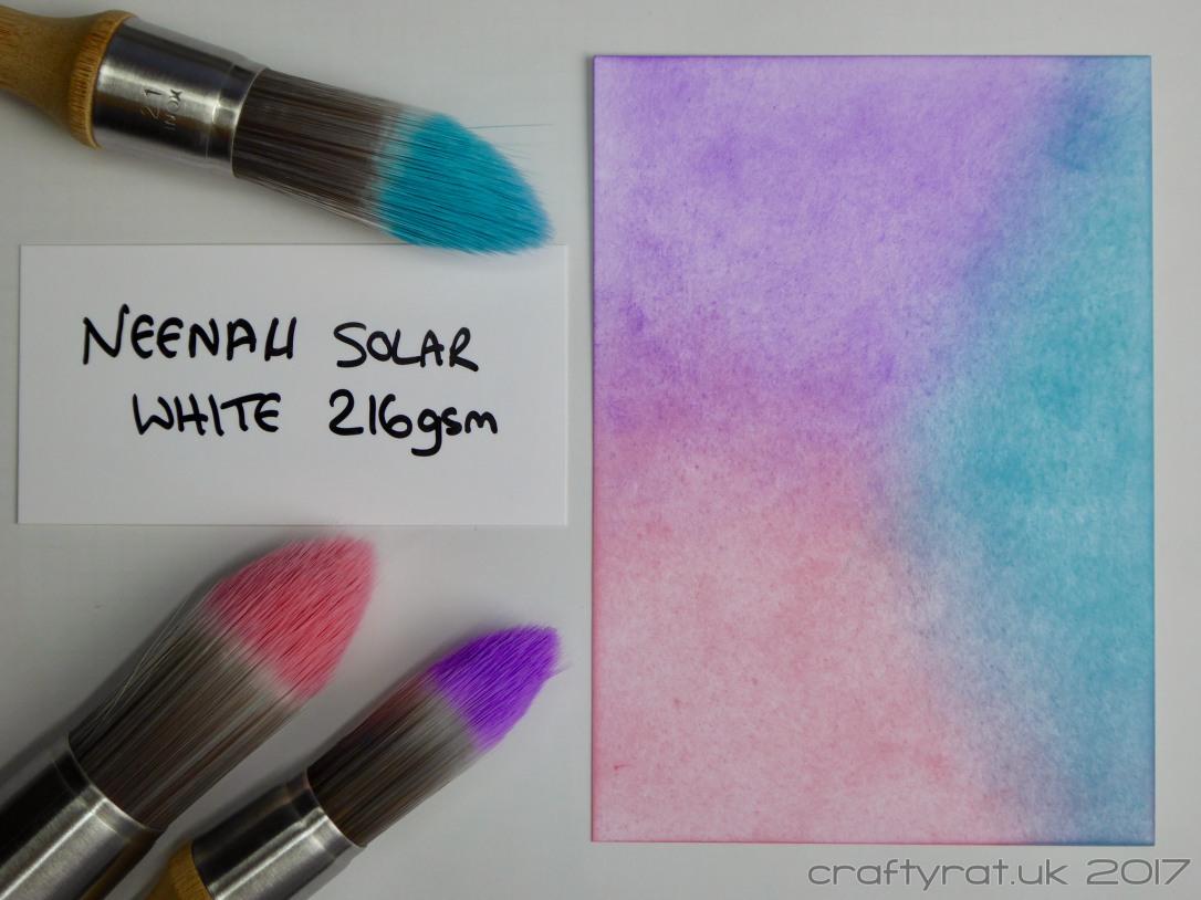
Some people don’t like the long handle on the Clarity brushes; personally, I find it helps get a nice light sweeping stroke across the page.
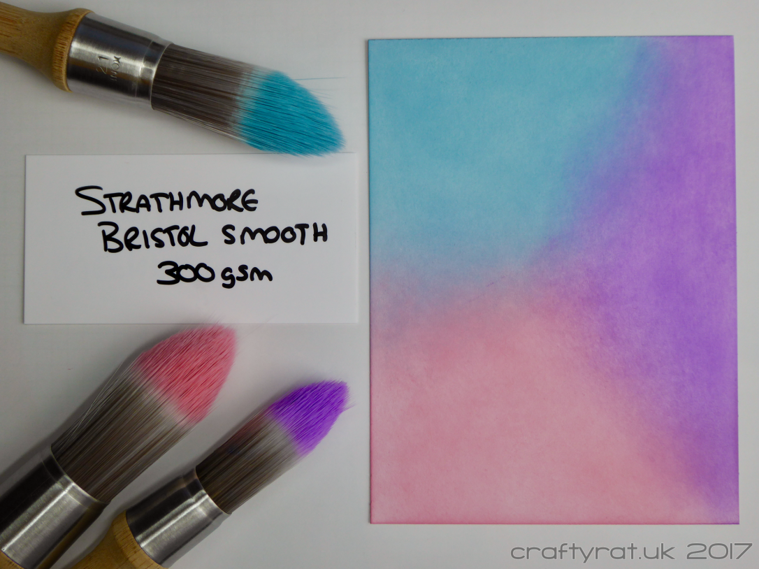
And once again on Bristol smooth
I started doing this to see how well I could get the inks to blend on Neenah cardstock, but that isn’t my preferred surface for Distress simply because it does tend to suck up the ink and make it harder to blend. I was going to leave it at that, but I can’t. What started as a reaction to bad blending has turned into a comparison of tools and I actually cannot post this without doing a test using the products I would actually use if I were making a card…
Distress Oxides with blending tools on Bristol smooth
Using the blending tools on Bristol smooth gives a very similar result to the one I achieved on Neenah; however, it took a lot less effort to lay down that much colour and a lot fewer passes to get the colours to blend.
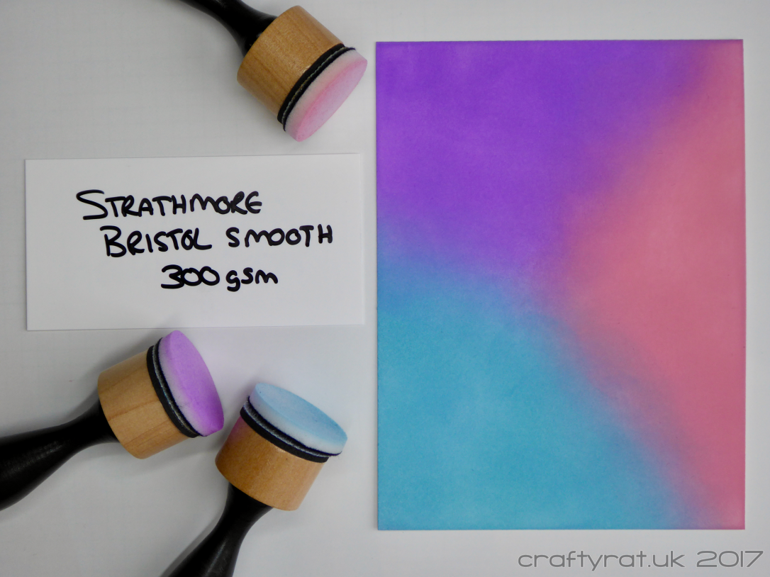
I thought I’d see if I could create a lighter finish — it is so much easier to blend the inks out on the Bristol and get rid of marks from the tool edges — and was kind of successful. I would happily do this if I just wanted a single colour textured background, but with so little ink on the page, it’s harder to blend between colours.
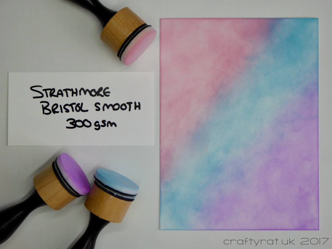
Distress Oxides with Clarity brushes on Bristol smooth
I managed to get much more even coverage on the Bristol, which of course also means it’s darker than on the Neenah but still lighter than using the blending tools on either cardstock.
General blending tips
Stick a Post-It note to your fingertips. That way you can hold the card in place without getting ink all over your fingers and fingerprints all over your blending.
Start off as light as you can and build the depth of colour up gradually. Put down too much ink at the start and it will be harder to blend it out.
Blending colours requires a bit of back and forth. You won’t get a good blend by putting the first colour down and then just overlapping the second colour a bit; you need to switch between the two a couple of times until you’re happy with the result. (I know you all know this, but the person in the video apparently didn’t.)
Summary
If you want a lighter finish, it certainly seems to be easier to achieve that with brushes. And that applies whatever ink you are using. Foams are a solid surface and will inevitably lay down more ink than a lightly loaded brush. I’m sure there are people out there who have the knack of getting smooth light coverage with a blending tool and heavy inks, but for the rest of us, brushes are definitely more forgiving.
Whether you go for the spendier option of the Clarity brushes, find a cheaper version, or even pick up some shaving brushes at the pound shop is completely a matter of preference and what you can, or want to, spend your crafting budget on. I haven’t tried shaving brushes so I won’t make any assumptions about how good they are for crafting.
Personally, I like the Ranger blending tool for laying down a solid layer of colour, but the brushes come into their own when, for example, you want to add ink through a delicate stencil.
And the tool that works the best for you will always be the one you spend time using: figure out what it does best and what it’s not so good at and get to know its quirks…
Supplies:
- inks:
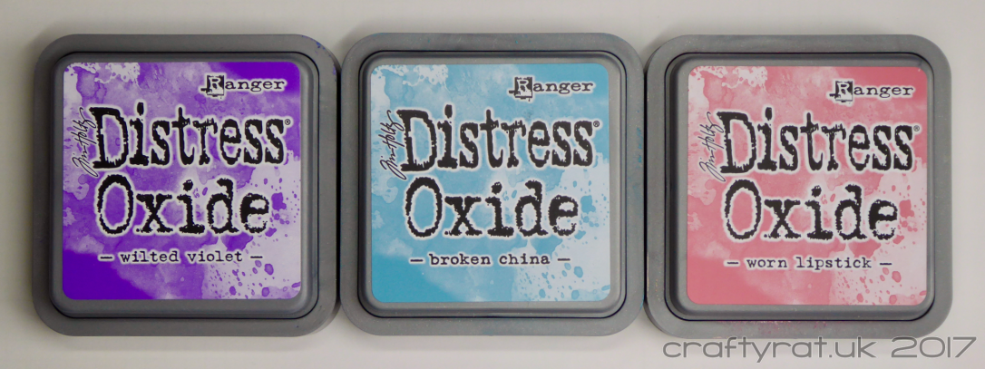
Distress Oxide – wilted violet, worn lipstick, broken china - paper and card:
Neenah Solar White 216gsm
Strathmore Bristol smooth 270gsm - tools:
Ranger mini ink blending tool
Clarity brushes
A quick thought about product reviews
I like the comparison and product review videos that Jennifer McGuire makes. She spends time using the product, figuring out how it works, and only then gives her opinion. What works for her may not work for me, but at least I can be sure that she has really given the product a fair chance and only recommends things from a position of experience.
To take one product that you use and love, another that you have used but never really got the hang of, and a third straight out of the packaging… by all means, do that and film it as a “first impressions” video, just don’t think that it is either a review or a fair comparison, and please don’t use it as the basis for recommending products to people.
Discover more from Crafty Rat
Subscribe to get the latest posts to your email.

Thank you for this. I was chatting to a crafty friend the other day and discussing the oxides which I haven’t got yet. This is a very useful comparison indeed. I have some ink dusters which are cheaper than Clarity brushes, and whilst different, also lay down a nice light layer of ink, and having used them with actual distress inks, I see the results could be similar with the oxides. I also purchased some Bristol board – mine is by Winsor and Newton – and so I will look to trying out distress ink with that as well. Thanks for the review. Xx
LikeLiked by 1 person
Glad it was useful! And I’m now kicking myself because I’ve literally just remembered that I have some ink dusters sitting in a drawer… I knew I’d seen a cheaper version of the brushes but I couldn’t for the life of me remember what they were called or apparently that I already had some… doh!
LikeLike
Nice post, really useful!
LikeLiked by 1 person
Glad it was helpful. I’ve picked up some shaving brushes since doing it, so I might have to do a follow-up test with those 🙂
LikeLiked by 1 person