
Once again, I’m cutting it fine creating a challenge entry in time… where does the month go? It took a while to figure out what I was going to do for this; there were three palettes to choose from and either of the others would have been easy choices for a floral card (both had pinks and greens), but I was drawn to the third with its more graphic greys and oranges.
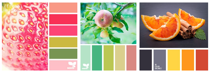 Inspired by:
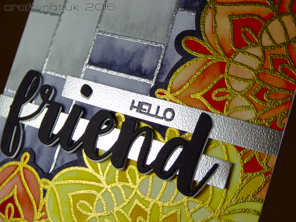
The layout was inspired by one of Dawn Woleslagle’s recent cards, though I had forgotten that she also used a “friend” die on hers until I went to find it again so I could link it here.
How:
The background mosaic was stamped in Versamark and heat embossed in silver to match the greys I planned to use. The lacy flower was stamped in the corner of another piece of watercolour card and heat embossed in gold to match the yellow and oranges. I masked that off and stamped it twice more to fill out the two sides of the panel.
I coloured each of the flowers with a single marker, varying the depth of colour by using differing amounts of water. Once it was dry I fussy cut it out, leaving a narrow border which I coloured in dark grey (and I even remembered to run my marker along the white cut edge).
Now I knew the shape of the front panel I could see which of the mosaic squares needed colouring. I did the ones bordering the panel in the darker grey and the others in light grey. I coloured a strip along the bottom of each rectangle and drew the colour up to the top with a waterbrush.
I die-cut the “friend” three times, twice in black for sturdiness and once in white to create an offset highlight along the edge so it would stand out. Then I decided to add the strip of silver behind it, so I could have got away without the extra layers, but I like how it looks. I heat embossed the “hello” on a second strip of silver and also mounted the dot of the i on it.
I used strong tape to fix the flowers to the background panel — the watercolour cardstock had only warped a little bit, but I didn’t want to risk them peeling apart. I added some thin foam tape behind the sentiment and carefully lined it up across the card. All that was left to do was to mount it on a slate grey card base with more strong tape. I did contemplate glossy accents on the “friend” and maybe a couple of sequins, but I’m practising stopping when it’s finished and not going too far. I can always add more later if I decide it needs it.
The thing I like most about this card — the thing I think makes it works as nicely as it does — is that grey background; there’s enough going on to be interesting without detracting from the yellow and orange of the flowers. I shall definitely be using that mosaic stamp again…
Challenges:
- Seven Hills Crafts July Colour Challenge
- The Daily Marker 30 Day Colouring Challenge
Supplies:
- stamps:
My Favorite Things – modern mosaic background
Waffle Flower – lacy flower
My Favorite Things – things with wings (sentiment) - dies:
My Favorite Things – friends - inks:
Versamark - embossing powder:
Judikins – silver detail
Judikins – gold detail
Judikins – black detail - colour:
Zig Clean Color Real Brush markers – 050 yellow, 060 brown, 070 orange, 090 gray, 091 light gray - paper and card:
Distress watercolour cardstock
Papermill Direct – smooth – gray slate
Papermill Direct – peregrina – sandgrain – silver - miscellaneous:
Inkadinkadoo – stamping mask paper
Discover more from Crafty Rat
Subscribe to get the latest posts to your email.

This is really striking and you’ve really used the colour scheme so well. Lovely watercoloured effect! Thanks for playing along with the Seven Hills Crafts Challenge xx
LikeLike
I love your card the embossing powder adds so much shine its great!
LikeLike